


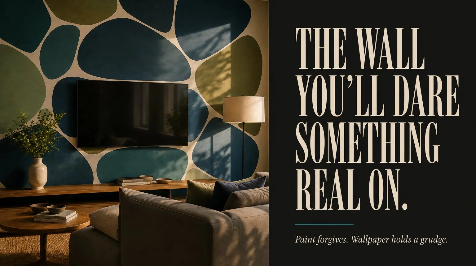
A television is the ugliest object in any living room and most people respond by trying to hide it. Cabinet doors, gallery frames arranged around it, screens that pretend to be paintings when nobody’s watching. The first room here does the opposite. Somebody painted enormous pebble shapes in teal, olive and denim blue across the whole wall, hung the screen dead center and let it read as one more dark rounded shape in a field of them. The screen stops being a hole in the room because everything around it carries the same visual weight. No cabinet has ever managed that.
That wall also settles the question these twelve rooms keep asking from different directions. Bold walls don’t fail because they’re loud. They fail because they’re in the wrong room – wrong light, wrong furniture, wrong viewing distance – and the loudness makes the mismatch impossible to ignore. So the sorting below goes by what the wall is made of, since paint, printed murals and framed art each commit you to a different degree and the commitment should match how sure you are.
Paint Forgives, Wallpaper Holds A Grudge
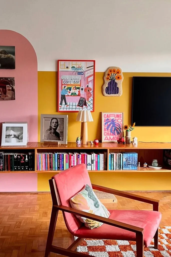
Four of these walls are paint. The pebble wall, the pink and yellow color block with the arch, the abstract color field behind the dining table and the striped lounge with it’s yellow bars and blue diagonals. Paint is the low-stakes end of bold, which sounds backwards when you’re staring at six-foot shapes, but a painted wall costs a weekend and two gallons to take back. A papered wall costs a steamer, a scraper and a Saturday of peeling in strips the width of your hand.
The pink and yellow room shows what paint does that paper can’t: it turns architecture into graphics. That pink arch isn’t an arch. It’s painted straight onto flat drywall and the yellow band running behind the record shelf stops at a hard line where the white upper zone begins, drawn to fit that one wall, around that one shelf, at that one height. You can’t buy that in a roll. Tape, a level, sample pots, patience. And matte or eggshell only – anything glossier catches window light along the tape lines and shows every place your two coats overlapped.
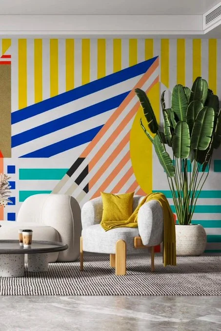
The striped lounge is the same trick at higher risk. Diagonals bleed under tape more than horizontals do, since you’re pulling against the grain of the roller strokes and I’ve never fully worked out why horizontal stripes read calmer than vertical ones in a real room when the theory says verticals are supposed to lift a ceiling. Possibly ceilings don’t want lifting as much as decorators claim. The room gets away with all that geometry because the furniture is nearly colorless, a pale boucle chair, a soft rug, one big banana palm, so the wall carries the entire personality and nothing argues back.
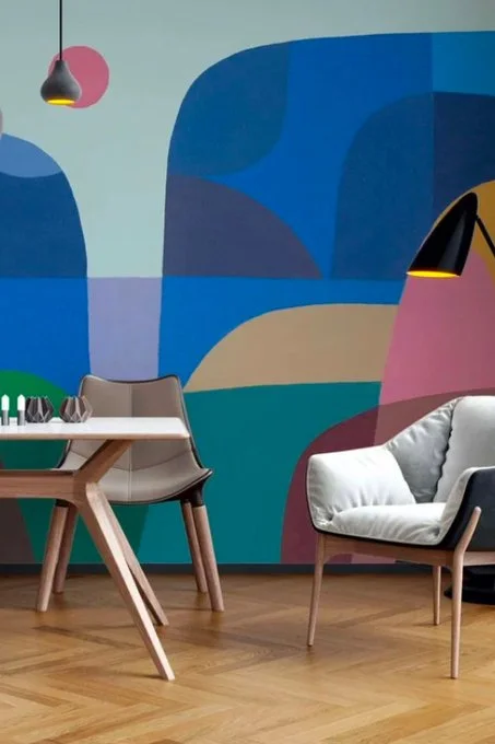
Which leaves the color-field dining wall, the one that looks like a mid-century painting swallowed the plaster. It sits on the borderline between camps. A design like that exists both as a hand-painted commission and as a printed mural and if your drywall is anything less than smooth, the printed version wins, because large flat sweeps of color show every patch and dimple the moment morning light rakes across them.
A Mural Is Furniture You Cannot Move
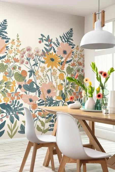
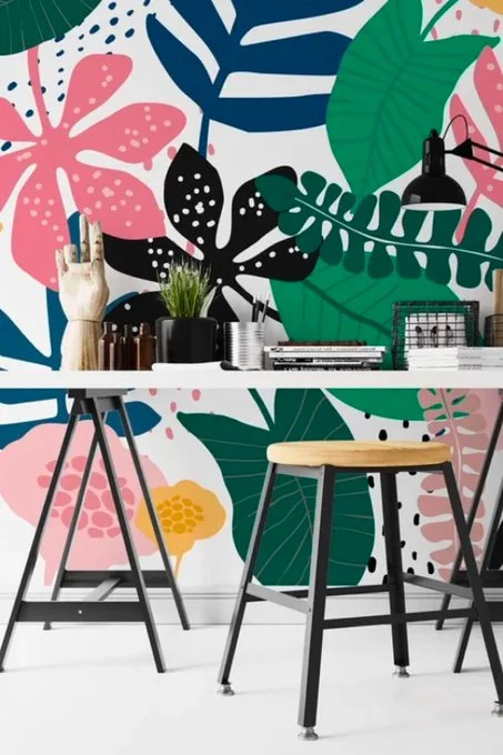
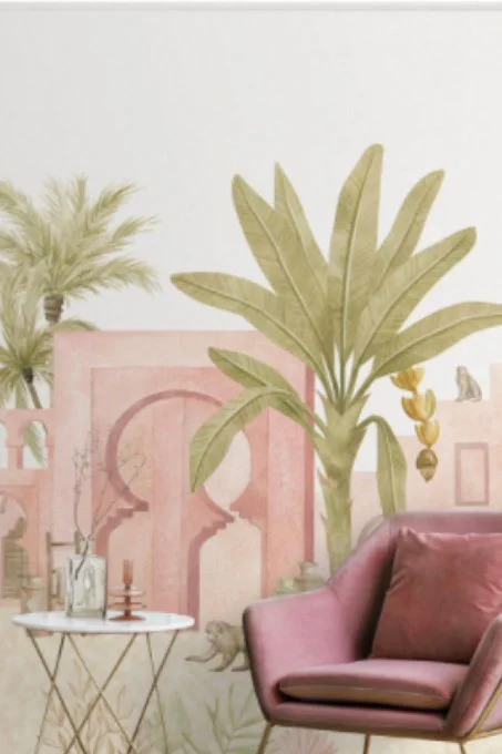
A printed mural is an image standing in the room like a large piece of furniture bolted to the studs. You aren’t choosing a color anymore, you’re choosing a picture and five of these rooms chose one: hot pink botanicals on teal, graphic tropical leaves behind a desk, a wildflower meadow in a dining room, a watercolor parrot over a child’s bed and pink Moroccan arches with palms beside a velvet chair.
Match the image to the room before you fall for the image on it’s own. That’s the entire discipline and here’s how these five sort out:
| The mural | Where it earns its wall | Why there |
|---|---|---|
| Wildflower meadow | Dining room | Stems rise from the baseboard and the blooms sit near plate height, so a seated eye lands in the flowers, not the empty space above them |
| Pink botanicals on teal | Powder room, one kitchen wall | Dense small-scale pattern wants close viewing; across a wide room it turns to static |
| Graphic tropical leaves | Workspace | Flat poster-style shapes stay crisp behind a busy desk, where painterly detail would fight the clutter |
| Pink arches and palms | Bedroom | The lowest contrast of the five, a wall you can fall asleep against |
| Watercolor parrot | Kid’s room | One creature and plenty of white space, so it survives years of furniture rearranging |
Does a loud mural shrink a small room?
No and the powder-room rule is why. Small rooms take the loudest paper best, because you’re never more than four feet from it and dense pattern reads as texture at that range. The teal botanical would be exhausting across twenty feet of living room. In a powder room it’s a jewel box and guests come out talking about it.

The meadow deserves a longer look because it solves the problem murals usually create, which is what happens where furniture meets the image. The printed flowers grow up from the floor the way a real border planting would, thinning toward the top and the oak table and white chairs sit in front like garden furniture. Most murals fight the furniture in front of them. This one recruits it. The bare cream upper third isn’t wasted wall either, it’s sky and it’s the only reason that dining room still feels calm with a hundred flowers in it.
Bedrooms for children run on a shorter clock. The parrot works because it’s a single figure with breathing room around it, but the kid outgrows the image faster than the paper wears out – plan on five to seven years, then a redo.
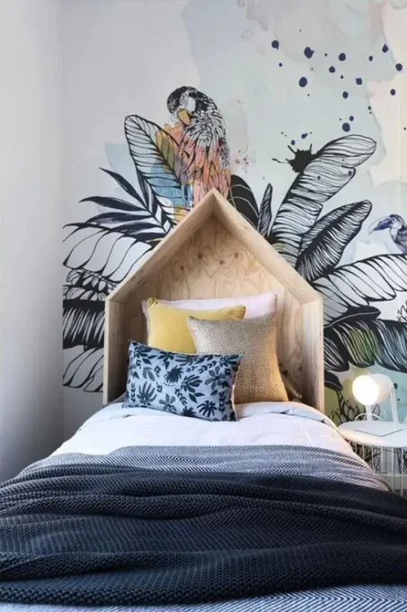
Pick something from the natural world, birds, leaves, maps, oceans, because a twelve-year-old will still tolerate a parrot and will absolutely not tolerate whatever cartoon ruled their nursery. Renters get a pass into this whole category through peel-and-stick versions and browsing a wallpaper collection by room rather than by prettiness is the habit that keeps you from buying a print you love for a wall that can’t hold it.
The Niche, The Half Wall And The Cabinet Front Hold Pattern Without Committing The Room
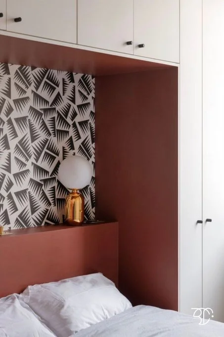
Cream cabinets wrap a rust-red box and only the back panel inside that box wears the black-and-white geometric paper. That’s the whole move in the deco bedroom. Pattern inside a frame. You get the jolt every time you walk past and none of the fatigue, because the print occupies maybe fifteen square feet and the quiet cabinetry does the talking for the rest of the day. One gold lamp in front of it and the composition is finished. For the pattern-shy, this is the door in and if you stop loving the paper in three years there’s one panel to strip, not a room.
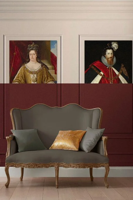
The burgundy sitting room runs the same restraint sideways. Paint stops at roughly three-quarter height, cream paneling continues above and two court portraits in gold dress hang just over the paint line, right where the eye expects a horizon. The dark band grounds the gray settee and the portraits give the wall a reason to be that serious. The pair look inherited, which is the point. A couple of old portrait reproductions against a deep color is the fastest route to a room that reads like it has a history it doesn’t and it costs a fraction of what any mural does.
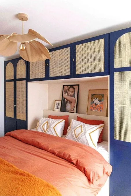
And the blue bedroom skips wall treatment entirely, because the storage wall is the bold wall. Deep navy frames around cane panels, arched tops on the outer doors, the bed tucked into the middle niche under a wooden lotus pendant. Nobody papered anything. The cabinetry does what a mural does, fills the wall edge to edge with rhythm and color, except it also holds your clothes and cane pulls the same double-distance trick as the powder-room botanical, reading as pattern from across the room and as texture from the pillow. Of the twelve, this is the wall that will look least dated in ten years and it isn’t close.
Paint first, is the bias here, every time you can get away with it. A brush and a level can produce more of these twelve walls than people assume and the wall you know you can repaint in a weekend is the wall you’ll dare something real on. Paper earns it’s keep when the image has to be finer than a hand can draw. The rest is nerve.