


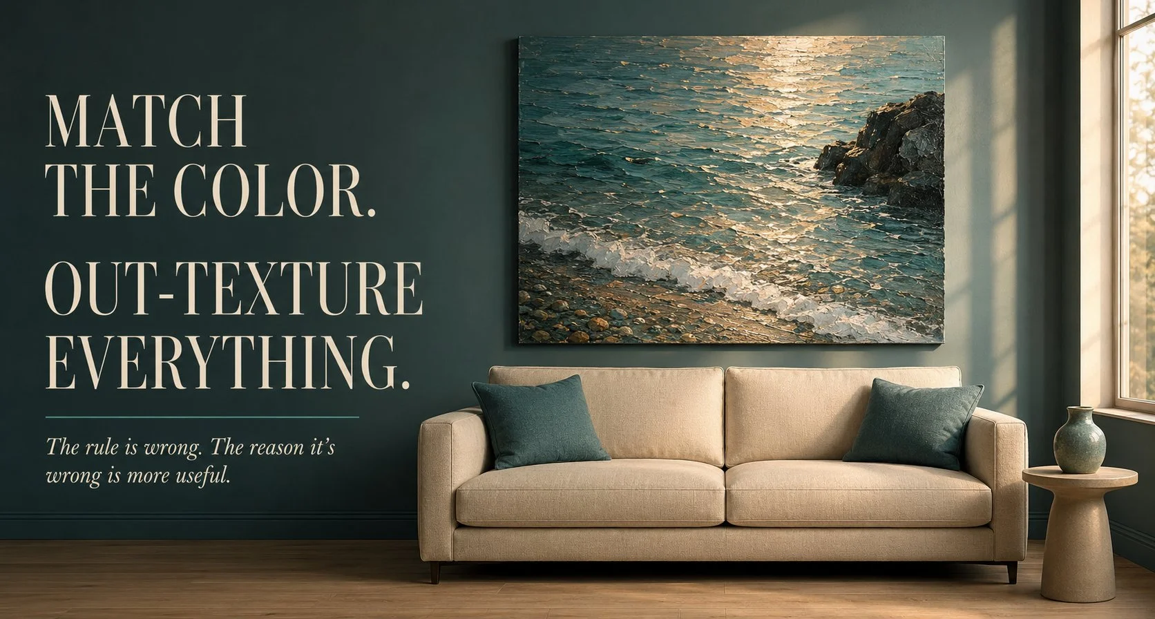
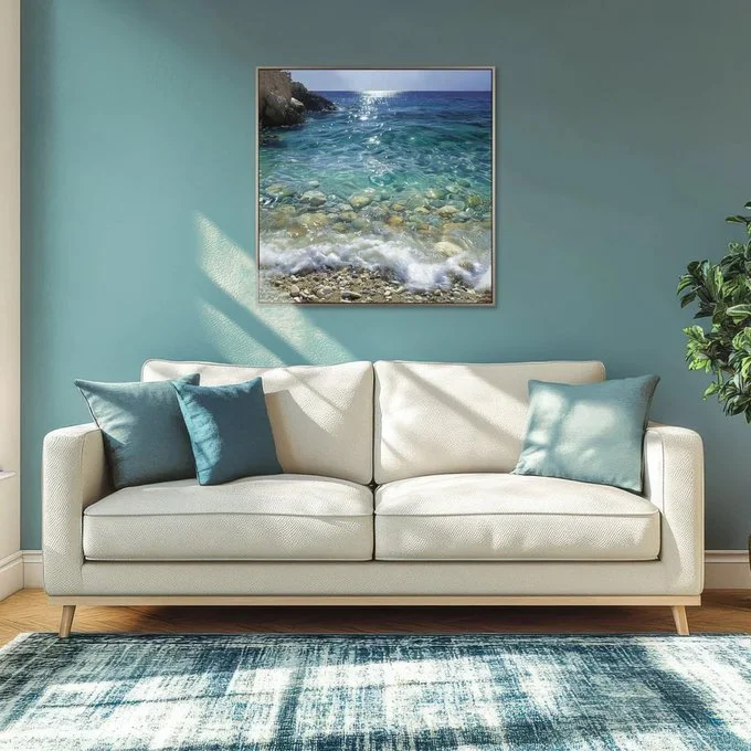
That room should not work. Teal wall, teal cushions, a blue rug and then a painting of teal water hung dead center above the sofa. Artists groan at this. Matching the art to the cushions is supposed to be the decorator’s cardinal sin, the thing that turns a painting into upholstery. And yet the room holds together and it’s worth slowing down to see why, because the reason is more useful than the rule.
Look at where the texture lives. The wall is flat paint. The sofa is smooth cream. The cushions are plain. Every surface in that room is quiet except the painting, which is crammed with it – sunlight breaking on water, wet pebbles, a line of foam, a dark rock shoulder on the left. The color matches but the texture doesn’t and texture is what your eye actually feeds on. So the refined version of the rule goes like this: match the color if you want, but the art has to out-texture everything near it. A flat graphic print in those same blues would have vanished into that wall like a swatch. The sea survives because it’s the busiest thing in the room by a mile.
The Orange Hulls Keep The Blue Dining Room From Going Flat
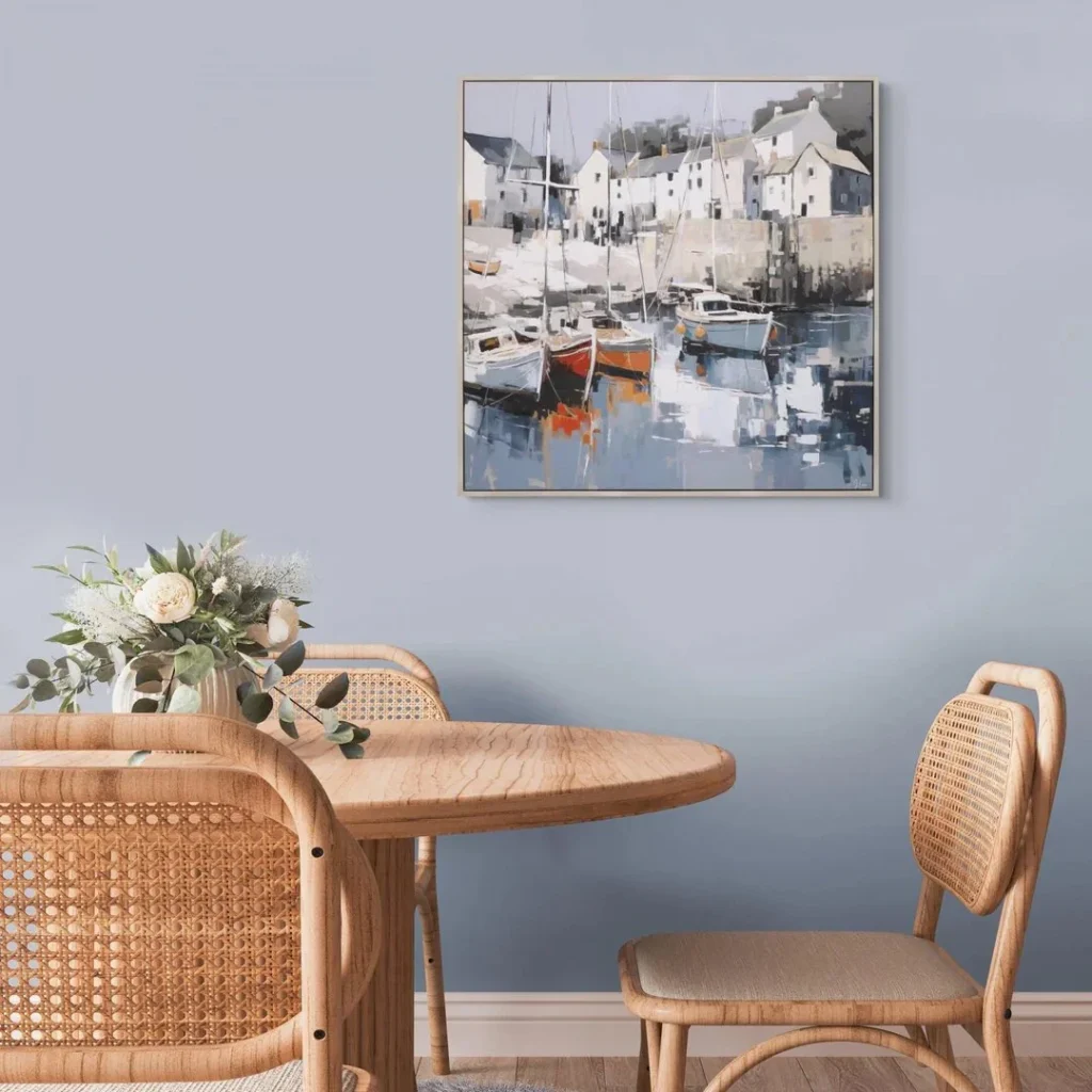
The harbor scene runs the same experiment at a lower dose and adds the second half of the lesson. Blue-gray wall, a painting that’s mostly the same blue-gray, cane and pale oak furniture underneath. Tonal, restful, one step from boring. What saves it are the hulls, a red one and an orange one sitting low in the composition, maybe five percent of the canvas. That’s the entire pulse of the room. Cover them with your thumb and the picture goes to sleep.
There’s a working number hiding in there. When a painting shares it’s palette with the wall behind it, it needs one color from outside that palette and not much of it. A sliver is enough. The warm boats also shake hands with the cane chairs and the oak table below, which is quieter matching than color-to-color, warm-to-warm across different materials. Nobody clocks it consciously. The room reads as finished and they can’t say why.
Rough Walls Want Quiet Art And The Frame Does The Refereeing
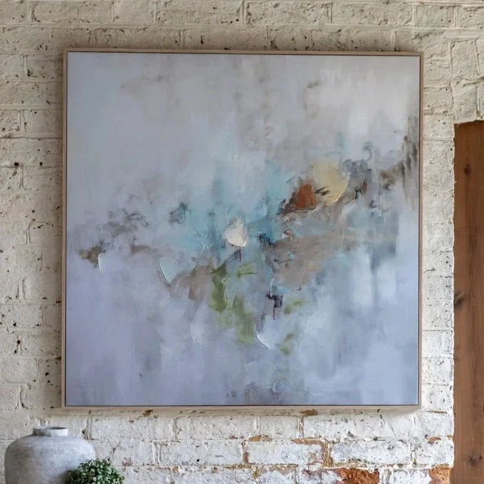
Now flip the situation. Sometimes the wall is the busy one and then everything I said about out-texturing runs in reverse.
The painted white brick behind the soft abstract has lumps, mortar lines, patched scars, a century of touch-ups. Hang something loud on it and the two argue. So the canvas goes the other way, fog-soft washes of gray and blue with one warm flicker in the middle and the eye gets to rest on it while the brick rumbles on around the edges. The oak float frame is the referee, a thin clean line that says where wall ends and painting begins. On a wall that rough you need that line. A frameless canvas would look like it was dissolving into the masonry.
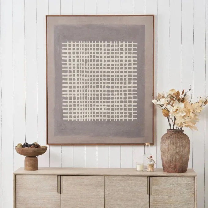
The grid canvas on the shiplap wall plays a smarter version of the same match. Shiplap is stripes, horizontal ones, floor to ceiling. The artwork answers with a woven grid, lines crossing lines, so the wall’s geometry continues into the frame instead of fighting it. And notice the frame is walnut against all that white, the darkest thing in the shot. One dark outline is doing the work of anchoring the whole pale wall.
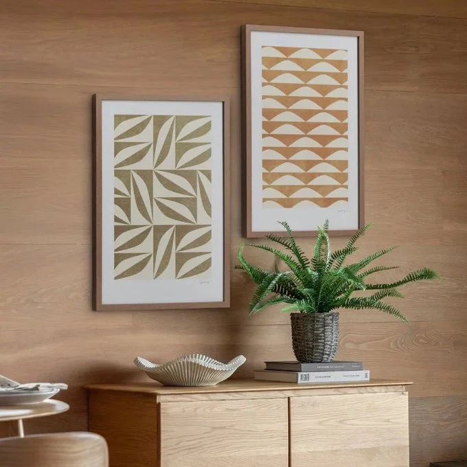
Wood paneling is the hardest of the three, because wood grain is already a pattern and already a color. The gold geometric prints get away with it by staying inside the wood’s own family, ochre and sand shapes in oak-toned frames, on oak veneer. Tone on tone on tone. It’s the harbor trick again without the orange boats and I’d argue it needed them, but a fern and a white bowl on the sideboard are covering that job. One hanging note for brick, while it’s on my mind: drill the mortar line, not the brick face. Mortar patches in a minute when you move. Brick doesn’t forgive.
Gloss And Gold Leaf Behave Like Lamps, So Hang Them Where The Light Moves
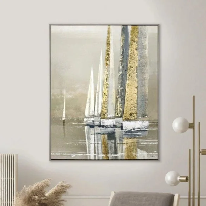
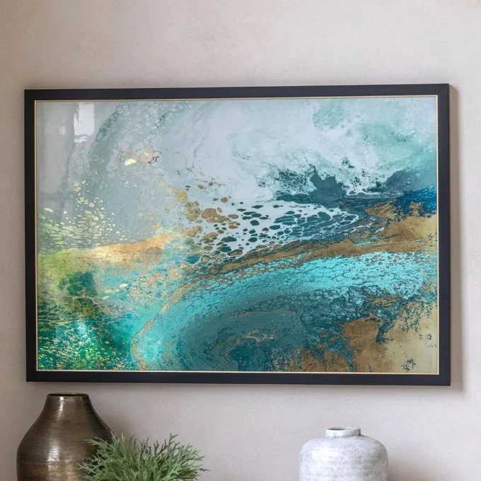
Two of these pieces aren’t really color at all, they’re shine. The sailboats carry actual gold leaf in the sails and the big teal abstract has that resin-gloss surface where pigment pools and cells open up like something seen from a plane. Reflective art is closer to a light fixture than a picture. It changes through the day, bright and specific at noon, warmer and stranger by lamplight and I’ve read three explanations for why gold leaf goes brassy under warm bulbs and don’t fully believe any of them. The practical part: hang shine perpendicular to a window, where raking light crosses it, not opposite one, where it becomes a glare rectangle every afternoon. A mirror obeys the same physics and pairing one with a gloss piece on the same wall doubles the moving-light effect without adding a single new color to the room.
A Pair Is One Artwork With A Gap In The Middle
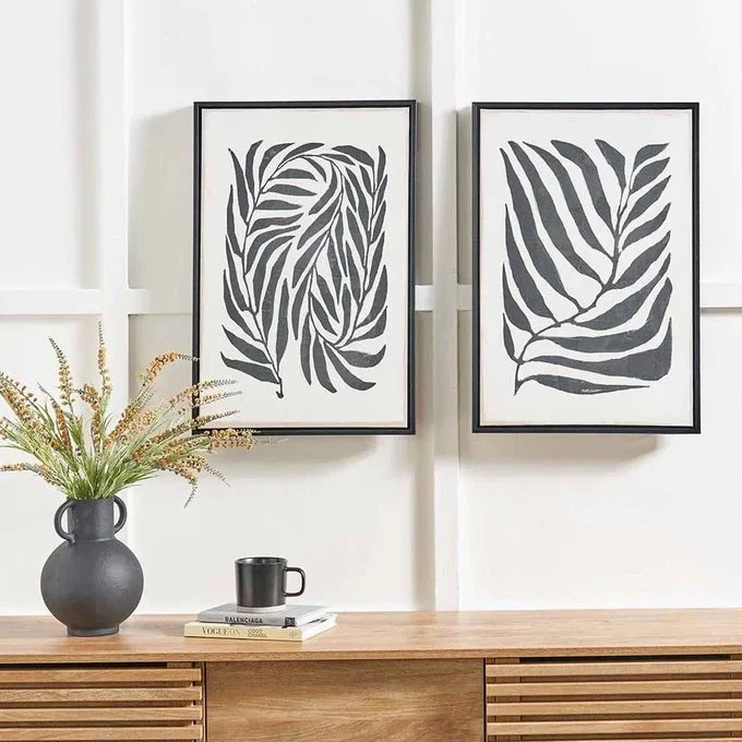
Four of these nine photos are pairs, which tracks, because pairs sell furiously and get hung badly all the time. The mistake is treating them as two separate pictures. They’re one composition and the gap between the frames belongs to it.
The black leaf prints show the standard done right:
- Same frame, same size, hung level, with a 2 to 3 inch gap. Wider than that and they stop talking to each other.
- Center of the pair, as a unit, lands at roughly 57 inches from the floor, the height galleries hang to. Over furniture, drop to a hand’s width above the piece.
- The pair spans about two-thirds of the sideboard below. Wider than the furniture reads top-heavy, much narrower reads timid.
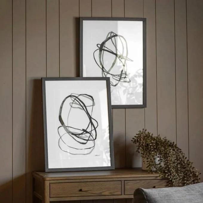
But the gold geometrics back in the paneled room broke the level rule on purpose, one frame hung a few inches higher than the other, stepped like a path and the scribble pair goes further, one hung and one leaning on the console beneath it. Leaning is legitimate. It reads relaxed, it lets you rotate art on a whim and it’s the only correct answer when you’re not allowed to put holes in the wall. The rules above are the baseline you break once you can hear the pair as one piece, the same way there’s no shame in browsing painting prints in pairs from the start rather than trying to marry two strangers later.
People agonize over art more than over sofas, which is backwards. The sofa costs ten times as much and you’re stuck sitting on the mistake. A painting that stops working gets moved to the hallway and half the time the hallway is where it was meant to live anyway. Buy the thing that stops you, then make the wall behave.