


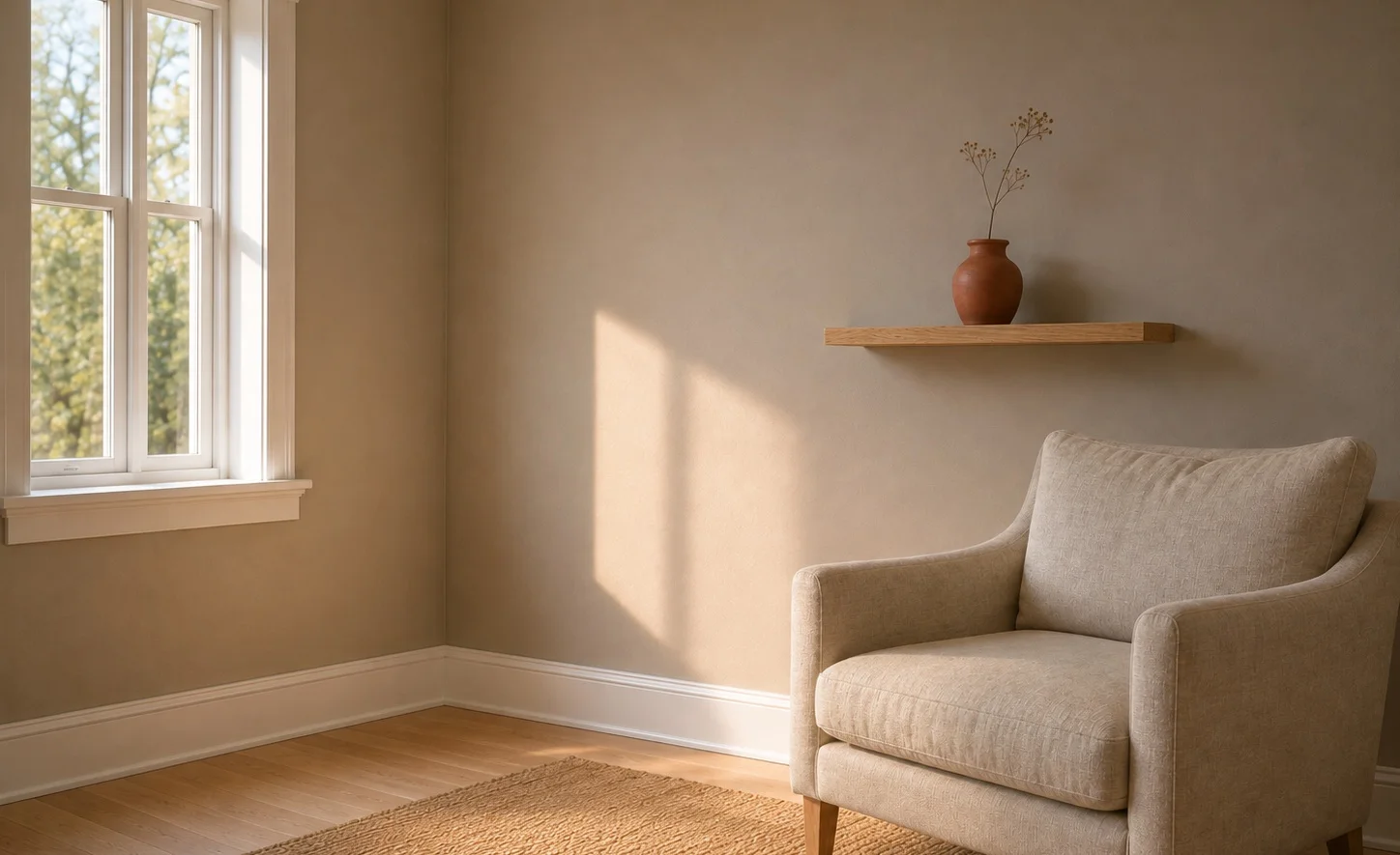
The chip is fine. Everyone likes the chip. What nobody tells you is that this color has one bad room and if that room is your room, no amount of styling fixes it.
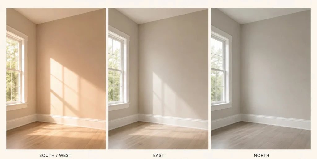
North light. Cool, diffused, blue-ish and it pulls the warmth straight out of SW 9589 until what’s left on the wall is a flat pale gray with something slightly muddy sitting underneath. Not ugly. That’s almost the annoying part, it isn’t bad enough to repaint immediately, so people live with it for a season telling themselves it’s fine and then one afternoon they walk into a friend’s south-facing living room painted the same color and understand what they were supposed to have gotten.
South rooms are where it works. Warm daylight lifts the beige, the faint red cast in the base shows up and it does the soft expensive thing it was built to do. West rooms get the same effect on a delay, arriving mid-afternoon with the low sun. East rooms I’m honestly less sure about, my instinct says morning light treats it well and it goes quieter after noon, but I’ve seen fewer of those and I’d rather say so than guess confidently.
Bulbs matter more than people expect here. Warm 2700K at night pushes the beige back up and genuinely rescues a dim room. 4000K daylight bulbs do the reverse. So a north-facing room isn’t automatically disqualified, it just means committing to warm lamps forever, which is a real decision about how you’ll light a room for years, not a fix you apply once.
The specs
- LRV 66.87, hex #DBD5CB, RGB 219 / 213 / 203
- Hue angle 38°, which puts it in the orange family
- Saturation 18%, so, muted
- Part of the Emerald Designer Edition
Sixty-seven is the number that matters. High enough to bounce roughly two thirds of the light back, low enough that actual pigment stays in it and that second half is rarer than it sounds. Most colors this light surrender the moment sun hits them and read as off-white for the rest of the day. Next to true white trim this one still looks like a color. That’s the whole appeal.
Trim has to be a clear step brighter or the line between wall and trim goes soft and you’ve wasted the trim. Pure White SW 7005 does it. Anything creamier and you get mush.
Now the thing about the name
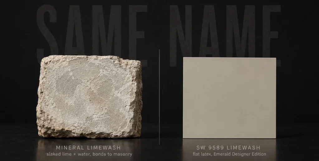
Two different products answer to limewash. One is a mineral finish, slaked lime and water, thousands of years old, brushed onto porous masonry where it cures into the surface instead of sitting on it and it moves and clouds and goes slightly chalky in a way that no flat latex will ever replicate. The other is this paint, named after that look.
People arrive at SW 9589 having saved photos of the first thing. Then they roll it on drywall, get a smooth even warm greige wall and feel vaguely cheated without being able to say why. The paint didn’t fail. It just was never going to do texture.
Going the other direction has it’s own problems. Real limewash wants a porous substrate, so your latex-primed drywall is a poor host without prep work and it chalks off onto sleeves for a while after application and it looks nothing like the sample until it fully carbonates. Which takes longer than the tin suggests. Some people split it, SW 9589 on the drywall and actual limewash on a brick fireplace or exterior masonry and that pairing works better than a compromise usually does, since the paint was matched to the finish’s tone to begin with.
Related and this bugs me: at least one paint database describes SW 9589 as having a green cast, apparently reading lime as the citrus fruit rather than the calcium hydroxide. Thirty-eight degrees on the hue wheel. Orange family. There is no green in it. I don’t know how that gets published and then repeated, but if you saw it somewhere and it worried you, it’s wrong.
Pairings, briefly
Shoji White and Accessible Beige sit near it on adjoining walls without conflict, Accessible Beige running deeper at about 58 and a touch greiger. For contrast the color needs weight, not another neutral and Iron Ore SW 7069 or Urbane Bronze SW 7048 as cabinetry or a door does more for it than any wall pairing will. Deep green, navy, terra-cotta all work as accents.
The materials matter more than the paint list, though. White oak, brass, warm brushed nickel, linen, jute. Earthy base wants earthy company. Surround it with chrome and cool gray tile and the warmth stops reading as soft and starts reading as slightly dirty, which is a hard problem to diagnose when you’re standing in the room wondering why it feels off.
If you’re cross-shopping
Greek Villa SW 7551 is up at 84, brighter and sunnier with a yellow-sand lean and it’s where to go if SW 9589 tests too dim in your space. Aesthetic White SW 7035 at 73 is the lighter, less earthy cousin. Accessible Beige at 58 is deeper, greiger and has been recommended into the ground. Restoration SW 9590 at 38 isn’t really in the same conversation, nearly thirty points down, moody where this is airy.
Across brands, Behr Pebbled Shore is close enough to swap on a wall. Benjamin Moore’s Balboa Mist and Farrow and Ball’s Skimming Stone are both in the neighborhood if you’re matching something already in the house.
Tape the sample to whichever wall gets the worst light in the room, not the best and go look at it around four on an overcast day. If it holds up in the bad hour it’ll be lovely in all the others and if it goes gray on you then, at least you found out for the price of a sample instead of a weekend.