


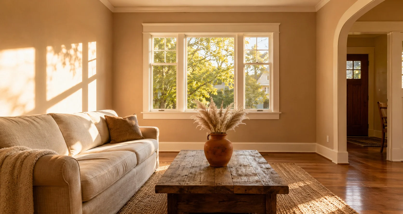
Ask the internet for a beige and it hands you Accessible Beige, the safe answer with a thousand upvotes and I think it’s a little overrecommended. Accessible Beige is beige with the warmth negotiated down, a gray tint pulling it toward greige so it can get along with cool modern furniture. Which is fine, if that’s your furniture. But if you came looking for beige because your room has wood, brick, stone, or cream in it, what you actually want is the undiluted version and that search ends at Bungalow Beige a lot more often than the forums suggest.
The numbers first, quickly: LRV 53, hex #CDBFB0, a true mid-tone. That 53 matters more than LRV does with whites, because half-light reflectance is deep enough to register as an actual color on the wall instead of a tinted white and still light enough that a normal room with normal windows doesn’t go heavy. The name is doing honest work too. This color behaves like the houses it’s named for, low and settled, more interested in sitting comfortably on it’s street than in being noticed from it.
What “true beige” means when the light turns on you
The undertone is red and golden brown with a touch of orange and there is no gray anchoring it underneath. That purity sounds like paint-blog trivia until you live with the alternative. Plenty of beiges hide a pink base that ambushes you in flat light, the wall drifts vaguely mauve and you spend months wondering what changed about the room.
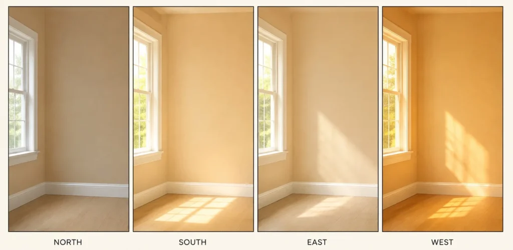
Does Bungalow Beige go pink in a north-facing room? No and that’s most of the reason to shortlist it. When the light goes cool it deepens toward tan and caramel, slightly more muted at worst, but it stays recognizably itself. South and west light bring the golden side forward and the whole thing turns lighter and cozier. At night, warm 2700K bulbs push it golden and 4000K bulbs pull it cleaner. Every shift runs along one axis, more warm or less warm, never sideways into a different color and that predictability is worth more than any swatch-card prettiness.
Where it belongs in the house
Living rooms and bedrooms are the natural home, a settled backdrop that competes with nothing and it has the useful trick of making large rooms feel intimate instead of empty. It works on kitchen cabinets as the warm classic answer where white feels too stark and it holds up in bathrooms without shrinking a small one.
The stronger claim: this is one of the few mid-tone neutrals I’d run through an entire house, hallways included. Whole-house colors get chosen for cohesion, that’s their whole job and most candidates are either so pale they disappear or so charactered they exhaust you by the third room. Bungalow Beige threads it. Six rooms in, it still just reads as the house’s color rather than a decision you keep re-noticing.
Pairings and the one combination to refuse
Trim in Pure White SW 7005 gives a crisp traditional edge; Alabaster SW 7008 keeps the trim warm and quiet if crisp isn’t the mood. For contrast, a deep navy like Naval SW 6244 or an earthy green like Retreat SW 6207 grounds it beautifully and dusty mauve accents will pull the red out of it’s base if you want to lean that direction. Tone-on-tone schemes work with Kilim Beige SW 6106 and Canvas Tan SW 7531, both close enough to layer without clashing.
The refusal: keep it away from icy whites, blue-grays and stark modern grays. Next to cool company the warmth stops reading as cozy and starts reading as yellowed and no amount of styling rescues that pairing. This is a color that wants warm neighbors or dark ones, not cold ones.
Finish-wise, eggshell or matte on walls, satin or semi-gloss on trim and cabinets. And sample it large across a full day, morning through lamplight. Standard advice, but it carries extra weight at this depth, because a mid-tone occupies far more of your vision than a white ever does.
The cross-shop list, sorted honestly
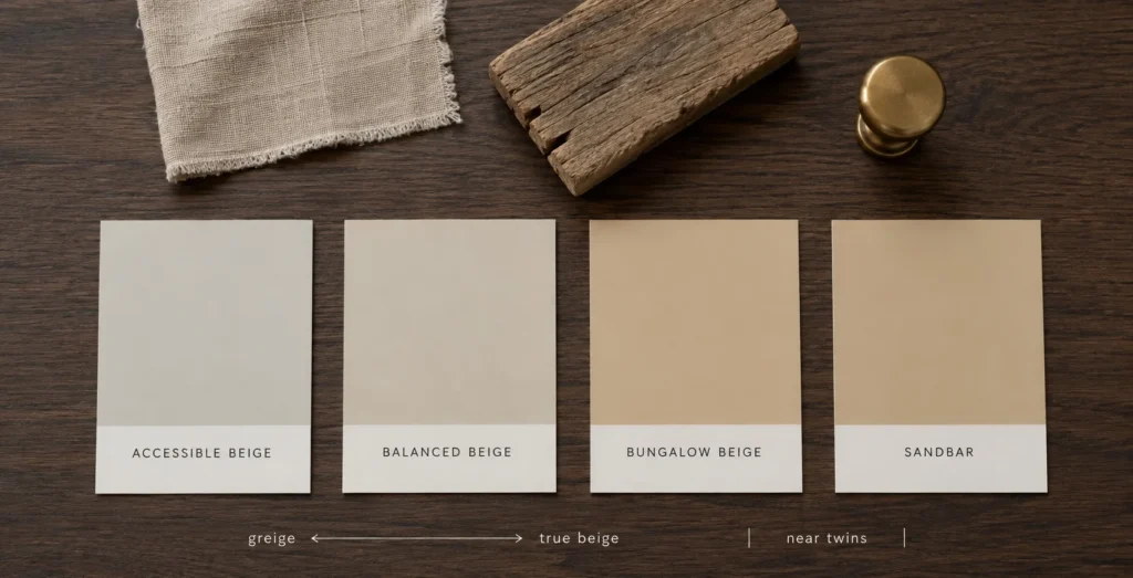
- Accessible Beige SW 7036: lighter at LRV 58, gray-softened toward greige. The pick when floors and furniture lean modern and cool. Standing next to real wood tones, it looks slightly apart from the conversation.
- Sandbar SW 7547: effectively the same depth, near twins on a wall. There isn’t much of a decision here, pick whichever chip your store has.
- Balanced Beige SW 7037: cooler and more neutral and the gap only shows once the chips sit side by side.
One last thing, since anyone shopping beige in this decade is quietly recovering from the last one. Around 2012 the whole country decided warmth was embarrassing and every flip, rental turnover and listing photo got the same flat gray that was supposed to read modern and mostly read as nothing. Beige never actually left houses during any of it. It left Pinterest, which is a different thing entirely and if you’ve been circling warm neutrals while flinching at the word, this color is a decent explanation of why the word refuses to die.