


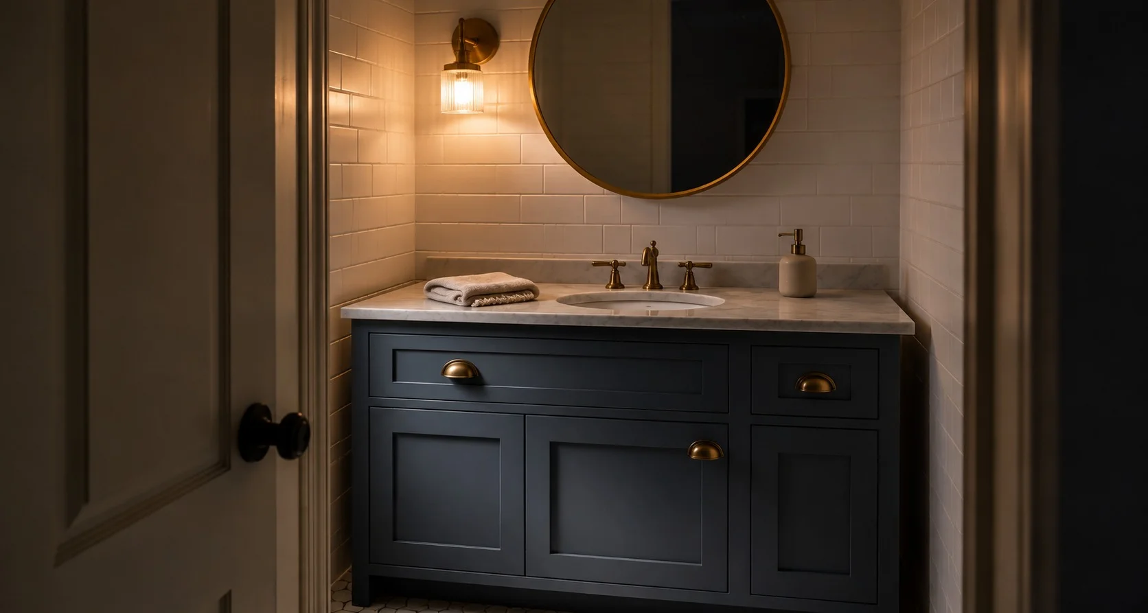
With a white, the question is which undertone. With Smoky Blue, the question is dosage. This is a muted, medium-dark blue-gray. We calls it a “chic, velvety blue,” and for once the marketing copy is fair. The LRV sits around 15, which means it absorbs most of the light that hits it and that is not a flaw. It’s the entire point. But it changes how you plan, because a color this deep behaves completely differently on one wall, on a set of cabinets and wrapped around a whole room.
The specs worth knowing:
- LRV: 14.6 (medium-dark, meaning this color soaks up light rather than bouncing it).
- HEX: #596E79 · RGB: 89 / 110 / 121.
- Undertone: gray, firmly. A clean blue-gray with no green or warm cast sneaking in.
- Family: We actually files it as a neutral and on the wall you’ll see why.
What an LRV of 15 Actually Demands From You
The three whites everyone compares endlessly all sit in the 80s and they throw light around a room. Smoky Blue sits at fifteen. It keeps the light. So every decision flips: instead of asking “will this glare,” you’re asking “does this room have enough light to feed it.”
The math worth carrying into the store goes like this. A low-LRV color wants roughly forty lumens per square foot of room to look rich instead of murky, call it around eight thousand lumens for a modest living room, spread across fixtures. Get the light right and Smoky Blue reads deep, calm and expensive. Starve it and it flattens toward a gloomy slate that makes the ceiling feel lower.
And the gray undertone is doing quiet, important work. It’s what pulls this color back from being a loud, saturated blue and lets it sit still. That’s why SW’s neutral classification isn’t as strange as it sounds. In a furnished room, Smoky Blue behaves like a background, not a statement, the way navy does in a good blazer.
The Dose Decides Everything, So Choose Your Dose First
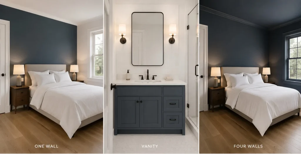
One accent wall is the entry point and honestly, it’s where most people should start. Behind a bed or a sofa, a single Smoky Blue wall gives you all the depth with none of the risk, because the other three walls keep feeding light into the room, so even a modest window budget can support it. If you’re nervous, this is the answer.
Cabinets and vanities are where this color quietly outperforms. On a bathroom vanity against white tile or on kitchen lowers under a pale counter, the gray-blue reads tailored rather than trendy and because cabinetry is a fraction of a room’s surface, the low LRV never gets the chance to darken the space. I’d argue this is the single best use of Smoky Blue in most houses. Brass pulls make it warm; brushed nickel or chrome keeps it crisp.
All four walls is the committed move and it can be gorgeous. A study, a dining room, a bedroom you want to feel like evening. The rule: this works in rooms with real natural light or rooms you deliberately want moody and enveloping. A south-facing bedroom wrapped in Smoky Blue is serene. A dim north-facing hallway wrapped in it is a cave. Same paint, opposite verdicts and the room decided, not the color.
Exteriors round it out. It’s rated inside and out and on siding or a front door it delivers that weathered, coastal-adjacent depth without going full navy. Against white trim it’s a classic.
What to Put Next to It
Dark colors live or die by their companions and Smoky Blue is easy company:
- Trim and contrast whites: Alabaster for a soft, warm pairing; Shoji White or Agreeable Gray if you want the whole scheme quieter and more tonal. Crisp Pure White works when you want maximum snap.
- Wood and texture: pale oak, natural linen, jute, cane. Warm organic materials are what keep a cool blue-gray from feeling cold and this is the pairing that matters most.
- For tonal depth: layer it with deeper neighbors like Slate Tile or lighter muted blues in the same family and you get that collected, layered look without any color actually shouting.
One painting note that saves frustration: over a light existing wall, a color this deep wants a tinted primer or gray-shaded undercoat and two topcoats. Skip that and you’ll be doing a third coat anyway. Matte or eggshell on walls (dark paint shows roller marks mercilessly in shinier sheens); satin or semi-gloss on cabinets.
The Blues People Cross-Shop It With
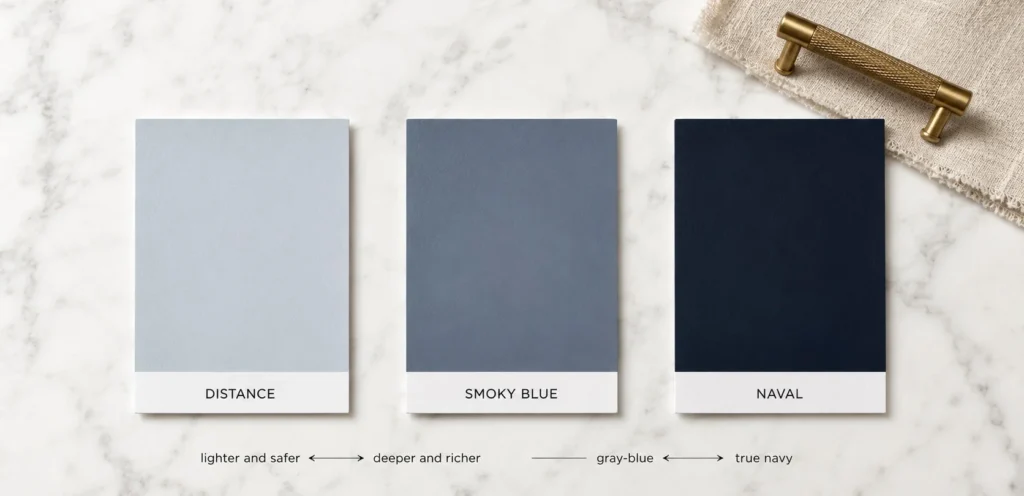
Qualitatively, since this is where people get stuck: Naval is the famous one and it’s a different animal, a true, much darker navy that goes nearly black at night, where Smoky Blue keeps it’s gray softness. Distance sits noticeably lighter and airier in the same muted family, the pick if Smoky Blue on all four walls scares you. Slate Tile runs deeper and grayer, moodier still. The honest sorting: if you want drama, go Naval; if you want safety, go Distance; if you want the balanced middle that still reads like a real decision, Smoky Blue is the middle and the middle is usually right.
I’ve seen this color make a plain builder-grade bathroom look custom for the price of a quart and I’ve seen it turn an under-lit den heavy and sad. The difference was never taste. It was light and dose. Sample it big, a poster-sized swatch, viewed morning and night with your actual lamps on, then pick the dose your room’s light can carry and Smoky Blue will hold up it’s end.