


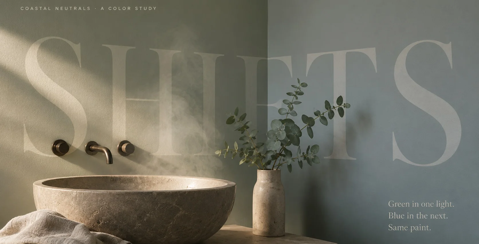
Here’s what you need to know before you commit: Sea Salt is a soft, muted color that shifts between green, blue and gray depending on the light in your room. It’s famous for reading blue far more often than people expect. That shape-shifting is the whole appeal and the whole risk. Get the light right and it’s a calm, spa-like coastal color. Get it wrong and you’ve painted a room a blue you didn’t choose.
The specs worth knowing:
- LRV: 63.233 (mid-to-high — reflects a generous amount of light, but with real pigment and depth).
- HEX: #CDD2CA · RGB: 205 / 210 / 202.
- Undertones: green primary, with a strong dose of blue and a moderating gray.
- Family: green (some retailers list it as gray — that tells you something).
What That LRV Actually Buys You
Light reflectance value runs zero to one hundred and Sea Salt’s sixty-three sits in a genuinely useful middle. It’s light enough to keep a small bathroom or a dim laundry room feeling open and airy, but it holds enough color that it never washes out to a bland almost-white. You get brightness and character, which is a harder balance than it sounds.
The gray in the mix is doing quiet work here. It keeps the green and blue from getting loud, so the color stays soft and liveable instead of turning into an obvious mint or a saturated coastal blue. But don’t let the gray fool you into thinking this reads as a gray on the wall. It won’t. It always keeps it’s color.
The Light Decides Which Color You Get
This is the part that matters more than everything else combined, so pay attention to your windows before you fall for a photo.
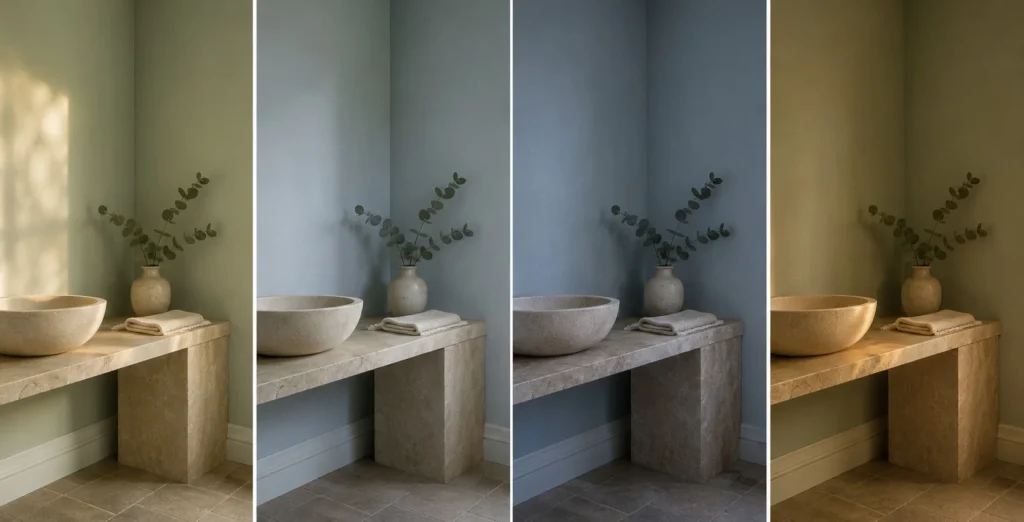
In a south-facing room with warm, abundant sun, Sea Salt shows it’s green side. The warm light pulls the green forward and it reads as a soft, sage-adjacent coastal tone. This is usually the friendliest version.
In a north-facing room with cool, flat daylight, it swings toward blue — sometimes a light bluish-gray, sometimes more blue than you bargained for. Here’s the useful reframe: north light makes warm whites look dingy and yellow, but it suits Sea Salt, because the coolness plays with the color instead of against it. Just know you’re getting the blue end of the spectrum, not the green.
West-facing rooms also tend to pull it blue, especially as the day goes on. And artificial light flips it too: warm bulbs bring out the green, cooler bulbs bring out the blue-gray.
The failure mode I see most often is someone falling for a green-looking Sea Salt in a bright south-facing showroom photo, then painting a north-facing bathroom and getting blue. It’s the same paint. The room changed the answer. I’ve watched this exact color read green in one room and distinctly blue in the room next door, in the same house, at the same hour — which is exactly why you sample it on your own wall, in the actual room, at more than one time of day. Peel-and-stick samples like Samplize make that painless.
Where It Works, Room by Room
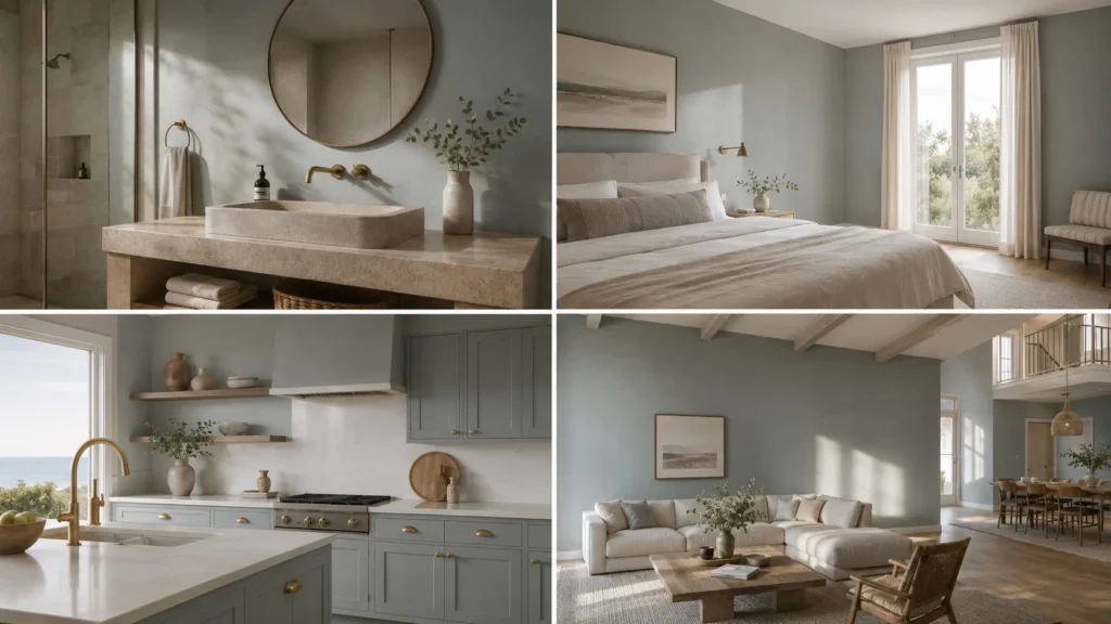
The honest headline: Sea Salt shines brightest in smaller, defined spaces and gets riskier the bigger and more open you go.
- Bathrooms: this is it’s home turf. The soft blue-green reads spa-like in a space where a cool white would feel cold and the mid-LRV makes the most of usually-limited bathroom light. Beautiful on vanities and cabinets too.
- Bedrooms: calm and grounding without going dark. It adds a whisper of color that plain white can’t and at LRV 63 even a small bedroom stays open.
- Kitchens: a favorite for cabinets — that blue-green-gray reads fresh and coastal against white counters and brass or nickel hardware.
- Laundry, mudrooms, entries: small functional rooms are perfect for it. A little personality where you’d otherwise default to boring.
Big open-concept living areas are where I’d be cautious. Across a lot of wall and a lot of changing light through the day, the chameleon act can get unpredictable. A little Sea Salt goes a long way.
How It Compares to the Colors It Gets Confused With
Sea Salt gets cross-shopped constantly with it’s coastal neighbors. The differences are subtle but they change the room:
| Color | LRV | The actual difference |
| Sea Salt SW 6204 | 63 | Green-gray with blue. The chameleon. |
| Rainwashed SW 6211 | 59 | Stronger blue, more saturated and greener overall. Reads deeper. |
| Comfort Gray SW 6205 | ~52 | Basically Sea Salt, darker. Choose it if you want more depth. |
| Tidewater SW 6477 | ~62 | Similar brightness, but genuinely a light blue — less green, less shifty. |
The one people mix up most is Comfort Gray — it’s the same family a shade down and it’s the move if you love Sea Salt but want it to commit a little harder.
Is Sea Salt a Neutral?
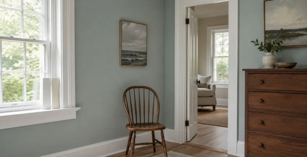
Technically, no. It’s a color a muted green with blue and gray in it not a true neutral. But it behaves like one in the right spot, sitting back as a soft backdrop that doesn’t shout. Pair it with clean whites (Pure White for a crisp, cooler edge; Alabaster for a warmer one) and let it be the quiet interest in the room rather than the star.
That’s really the whole pitch. Sea Salt isn’t a color that sits still and if you want something predictable, it’ll frustrate you. But if you sample it properly and put it where the light suits it, you get a soft, coastal calm that a flat neutral could never give you.