


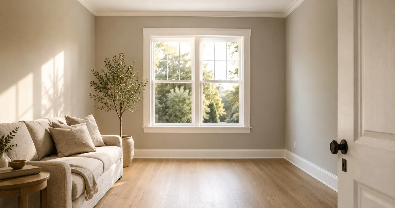
Every paint color worth writing about usually has a catch. Sea Salt turns blue when you weren’t looking. Aesthetic White drifts gray in cool light and warm by afternoon. The interesting colors are interesting because they misbehave and half the job of a color guide is warning you about the surprise.
Agreeable Gray is the exception and that is precisely why it outsells all of them. It is the best-selling paint color – not the best-selling neutral, the best-selling color, full stop. And it earned that spot not by doing something remarkable but by reliably doing nothing remarkable at all. It is the color that, as designers keep putting it, works when nothing else will.
This is a guide to a color whose whole appeal is that it won’t surprise you. Which turns out to be a harder thing to engineer than it sounds.
What It Actually Is
Agreeable Gray is a warm greige: a balanced blend of beige and gray with a subtle green-taupe quality underneath. Not a cool gray, not a heavy beige, but a genuine middle. The warmth keeps it from feeling cold; the gray keeps it from turning creamy or yellow. Neither undertone is allowed to win and that stalemate is the entire design of the color.
The specs worth knowing:
- LRV: 60 – mid-range. Light enough to keep a room open, dark enough to read as an actual color rather than a near-white.
- HEX: #D1CBC1 · RGB: 209 / 203 / 193.
- Undertone: warm greige, with a faint green-taupe and an occasional violet flash in cool light.
- Family: neutral / greige, but committed to neither side of the line.
That LRV of 60 is doing quiet work. Lighter neutrals go flat and washed-out on a big wall; this one has enough body to hold a room without darkening it. It has the warmth and presence that near-whites lack, without the weight that a true beige brings.
The Reliability Is the Feature
Here is the part that separates Agreeable Gray from every shape-shifter on the fan deck: it rarely surprises in the wrong direction.
That does not mean it never moves. Color consultants have called it a chameleon and they’re not wrong that it responds to what’s around it. But it’s range is narrow and it’s shifts are gentlemand it always lands somewhere liveable. Compare that to a color that reads green in one room and blue in the next and you understand why a builder painting forty units or a homeowner doing a whole house in one color, reaches for this one. Predictability is worth more than personality when you are committing a lot of wall to a single decision.
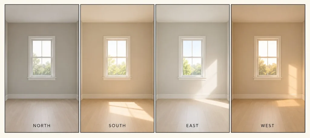
Walk it through the orientations and you’ll see how small the swings are.
- North-facing rooms: reads slightly more gray, a touch cooler and calmer, the green-taupe faintly more visible. Crucially, it holds it’s warm character here far better than most greiges at this depth, which is exactly where cheaper greiges go cold and dreary. This is a genuine strong suit, not a warning.
- South-facing rooms: the beige undertone warms up, the color softens and brightens. This is it’s most balanced, flattering face.
- East-facing: cooler and lighter in the morning, settling to a neutral greige as the day goes on.
- West-facing: picks up warmth and coziness as the afternoon light drops in.
Notice what’s missing from that list: a failure mode. Every version is a usable version. The color moves within a lane instead of jumping the rails and that is the whole reason it’s on more walls than anything else in the country.
Artificial light nudges it the same modest way – warm bulbs pull the beige forward and relax it, cool bulbs sharpen it grayer. Layer your lighting (ceiling, lamps, wall) and it stays comfortable from morning to night rather than swinging with the fixtures.
Where It Works, Which Is Almost Everywhere
The room-by-room advice for most colors is a list of cautions. For Agreeable Gray it’s closer to a list of confirmations, because versatility is the point.
Living rooms are it’s natural habitat. It reflects light without going stark and sits as a soft backdrop under any decor, modern, farmhouse or traditional. This is the “works when nothing else will” color in it’s purest use.
Bedrooms come out calm and grounding, warm enough never to feel cold, gray enough never to go creamy. It pairs beautifully with natural wood, which pulls it’s warm undertone forward.
In kitchens it’s a favorite on both walls and cabinets. On cabinetry the balanced warmth reads current against white counters and brass or nickel hardware without the coldness of a true gray.
Bathrooms stay light and clean without the clinical chill a cool white brings to a tiled room and the mid-LRV makes the most of limited light.
Then the small functional rooms – laundry, mudrooms, entries, offices – where you’d otherwise default to boring white. This gives them quiet character with zero risk. It even holds up outside, working as a body color alongside crisper whites for trim and pop-outs.
If there’s a place to hesitate, it’s a genuinely dark room, where at LRV 60 it can read muted and heavy. That’s the one condition where it’s reliability runs out. It needs some light to stay light.
The Catch Nobody Mentions: It’s Reliable on the Wall, Not in the Pairings
Here is where the reliability story earns it’s one asterisk and it’s the thing most guides skip because they’re so busy calling the color foolproof.
Agreeable Gray is forgiving on the wall. It is not forgiving in it’s combinations. The wrong trim, the wrong accent or the wrong flooring can drag it’s subtler undertones into the open and leave the whole room feeling faintly unresolved, that green-taupe or violet flash suddenly visible where it had been invisible. The color itself behaves. The pairings are where people actually go wrong.
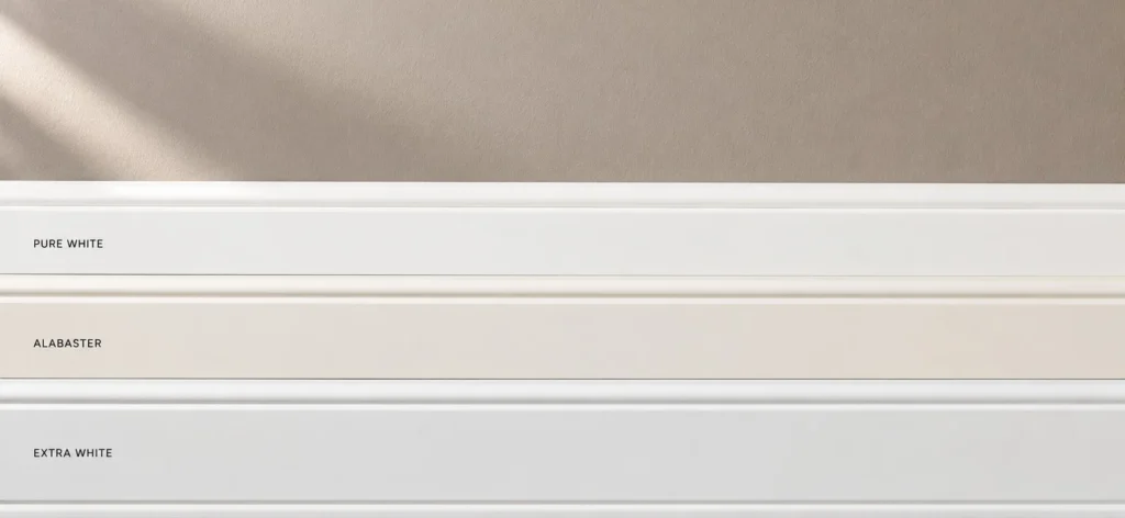
Trim is the single most important decision. It determines whether the walls read warm and cohesive or slightly disconnected from everything around them.
- Pure White is the default and the safest – warm enough to complement the greige, crisp enough to define it.
- Alabaster softens the whole scheme, warmer and more traditional.
- Extra White sharpens it, a cooler crisp contrast for a contemporary edge.
Go too cool and stark on the trim and you throw the wall’s warmth into relief in a way that reads as a mismatch rather than a contrast, the same trap that catches warm whites.
For accents and adjacent walls, the reliable partners share it’s warm backbone: a deeper tonal greige like Dorian Gray, a dramatic warm dark like Urbane Bronze, a sage like Evergreen Fog that shares the undertone or a warm-leaning navy like Naval that contrasts without fighting the greige. And it loves natural materials – wood especially pulls the warmth forward, while brushed nickel or aged copper lean it faintly industrial.
The Neighbors It Gets Confused With
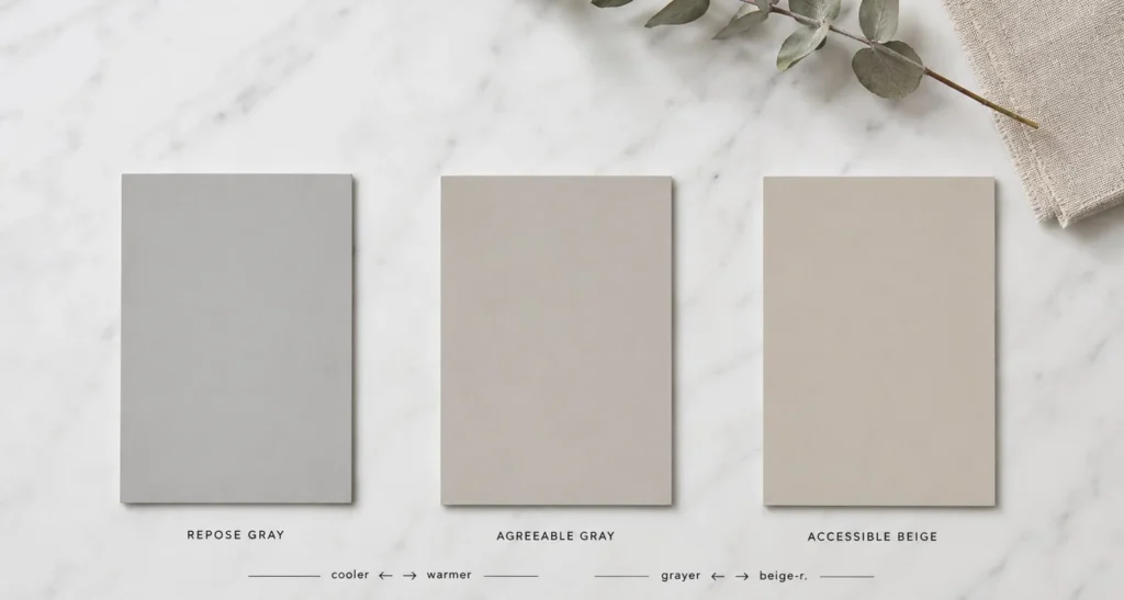
Three colors get cross-shopped with it constantly and the differences are small but they decide the room.
- Repose Gray is the cooler sibling, more true gray, less beige. Choose it for south-facing rooms with abundant warm sun, where Agreeable Gray’s warmth might tip too soft. Agreeable Gray is the safer pick for north light and cool bulbs.
- Accessible Beige commits harder to beige, warmer, more color, less of the gray balance. If you want the wall to lean clearly beige, that’s the one. Agreeable Gray stays balanced between.
- Revere Pewter is the characterful, reactive alternative, more complex and more grounded, better in traditional south-facing rooms, but nowhere near as predictable. It has more personality and more risk. Agreeable Gray trades that personality for reliability, which is the whole bargain.
Is It Right for You?
Choose Agreeable Gray when you need one neutral that works across many rooms and lighting conditions, when you want warmth with genuine body rather than a near-white, when your rooms face north or lean on cool bulbs or when you simply want a foundational color that will not embarrass you. It is the whole-house answer, the color you paint when you don’t want to make the decision five more times.
Reach for something else when you specifically want a crisp cool gray (Repose), a clearly beige wall (Accessible Beige) or when the room is genuinely dark, where a higher-LRV color will serve you better.
The Honest Verdict
Agreeable Gray earned the most-popular-color-in-America title the unglamorous way: by being the neutral that suits more rooms, orientations and material palettes than anything else in the range and by almost never going wrong on the wall. Sample it anyway – even reliable colors read differently in your specific light, more beige in dim rooms, brighter and cleaner in strong daylight – and give the trim decision more thought than the wall color, because that’s the only place this color trips people.
But the reason it’s on more walls than any other color in the country isn’t mystery or drama. It’s the opposite. In a category full of colors that surprise you, Agreeable Gray’s whole trick is that it doesn’t. And once you’ve committed a whole house to a single color, you understand exactly why that’s worth more than a color that photographs better and lets you down by afternoon.