


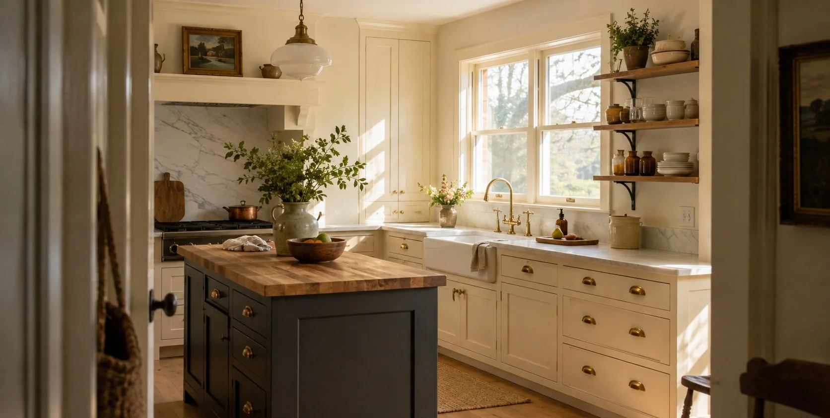
People usually meet this color at the sample desk when they are already stuck between three or four whites with nearly identical chips, so let me save you some time. Dover White SW 6385 is the yellow one. Out of all the popular warm whites it has the most visible cream in it and that is either the reason to buy it or the reason to put it back and everything else in this review is really about figuring out which of those applies to you.
The color sits at an LRV of 82.5, so it is bright, near the top of the off white range and it keeps a room open. But brightness is not what people notice about it. They notice the warmth, because unlike the whites that carry a hint of cream you can only see in a side by side, Dover White reads warm from across the room. Designers describe it as a color that wants to be seen and that is accurate.
The Homes Where It Belongs And The Ones Where It Backfires
Painted on a wall it gives you rich, creamy, traditional, the kind of light that feels like late afternoon even at noon. In a farmhouse kitchen, a cottage, an older home, it looks like it was always there. In a modern space where the owner wanted a clean barely there backdrop, it looks like the walls went slightly beige and the owner ends up repainting or resenting it, because the paint did exactly the job it was made for and they wanted a different job done.
And a blunt observation from watching people pick whites, if you are already worried Dover White SW 6385 might be too warm for your space, it probably is. That hesitation is the answer. The people who love this color never had the doubt in the first place.
It Handles North Light Better Than Almost Any Warm White
The light behavior is steadier than most whites, which surprises people. It’s character does not flip the way a chameleon color does, only the volume of the yellow changes.
South facing rooms flatter it the most, the daylight activates the cream and the walls glow without tipping into actual yellow. The more interesting result is north facing rooms, which normally ruin warm whites and Dover White holds up there better than nearly anything comparable because it’s creaminess pushes back against that cold flat light and stops the room feeling clinical. That north light forgiveness is honestly the best reason to choose it over it’s rivals.
East And West Rooms Swap Roles Through The Day
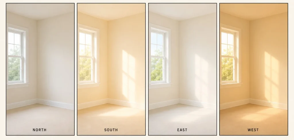
East facing rooms get the same favor in the afternoon, once the morning brightness drains away and the color quietly re warms the space. West rooms run it in reverse, fresher in the morning, then richer and cozier when the amber evening sun floods in. Your bulbs finish the job after dark, warm 2700K lamps deepen the cream while cooler 4000K daylight bulbs pull it cleaner, so the lamp aisle is part of this decision too.
Skip It Entirely In Rooms With Little Natural Light
Dark rooms are where I would stop you. A room with very little natural light gives the yellow nothing to bounce off and the color goes flat and a bit heavy instead of creamy. This paint needs light to look like itself, so if your room stays dim most of the day, pick a cleaner white and move on.
Greek Villa And Alabaster Are The Two That Cause The Agonizing
Greek Villa SW 7551 is a touch brighter and reads cleaner and sandier, a warm white rather than a warm cream, fresher, a little more coastal. Dover White next to it looks richer and more traditional. If your inspiration photos are airy and light, Greek Villa is probably the one you were imagining.
If You Keep Wavering, Alabaster Is Your Answer
Alabaster SW 7008 is the harder call and the one people go back and forth on for weeks. It sits at nearly the same brightness but it is more neutral, more beige, less obviously yellow and that makes it the safer all rounder. My honest take, if you keep bouncing between Alabaster and Dover White, choose Alabaster, because that indecision usually means you want warmth but you are nervous about seeing it, which is the same hesitation I mentioned earlier. Dover White SW 6385 is for the person who read the first paragraph of this review and thought good, that is what I want.
Pure White Is The Trim Partner, Shoji White Is A Different Conversation
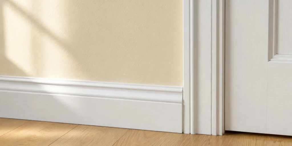
Pure White SW 7005 is not a competitor at all, it is the trim color. Cool, crisp and the standard partner here, because Dover White walls with Pure White trim give the creamy walls a clean edge and each makes the other look deliberate. Shoji White SW 7042 comes up in these searches too but it sits nine points darker, a muted greige that can pull pink or green depending on the room, so it is really a different conversation.
What To Put Around It And In What Finish
Surround Dover White with gold, brown or beige and it reads closer to a clean white. Surround it with icy gray or blue and the yellow jumps forward and can start to clash, which is also why it makes poor trim next to cool wall colors, it wants warm greige, warm beige or warm gray beside it or nothing at all.
A Kitchen Scheme That Works In The Real World
Dover White SW 6385 on the perimeter cabinets, Mindful Gray SW 7016 on the walls and an island in Gauntlet Gray SW 7019. The grays give the cream something to read white against and the dark island grounds the whole room. For accents elsewhere in the house, earthy companions like Dakota Wheat SW 9023 or the deep blue gray Waterloo SW 9141 flatter it’s warmth instead of fighting it.
Outside it reads slightly creamier on a facade and suits sunny warm climates best and one colorist pairing worth stealing is Dover White trim over Moth Wing SW 9174 siding.
Sheen And Sampling
Eggshell or matte on walls for a soft forgiving finish, satin or semi gloss where hands and mops touch, so trim, doors and cabinets. And put a big peel and stick sample up before committing, watch it through a whole day, because the color you see at 3pm in full sun and the color you get under lamps at night are two different rooms and with this much cream in the mix you want to have met both before the rollers come out.