


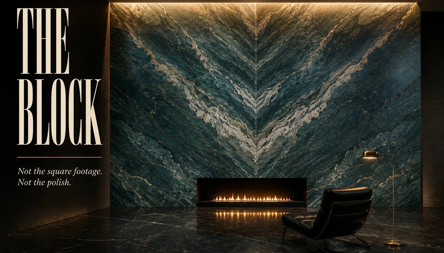
Two slabs cut off the same block, opened out like a book so the veining mirrors itself down a center line. That’s what the teal wall is, and that mirroring is the reason it costs what it costs. Not the color. Not the polish. The block.

Brass pendant, wood ceiling, one framed print. Everything else in the room got out of the way.
You cannot walk into a stone yard and pick this off the rack the way you’d pick a countertop. Bookmatching needs sequential slabs, meaning slab 4 and slab 5 cut one after the other from the same block, still holding the same vein in the same place, and the moment somebody else buys slab 5 for a kitchen island your wall is gone. So you either buy the pair on sight or you buy more of the block than you need and eat the rest.
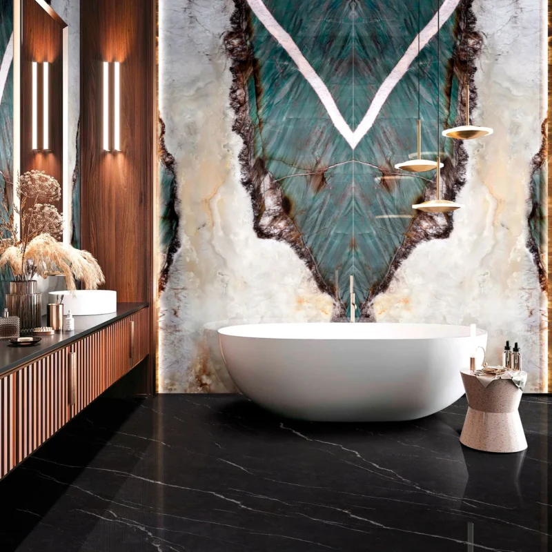
Black marble on the floor so the two surfaces aren’t competing.
The block is what you’re paying for, not the square footage
Look at where the V lands in these three rooms. In the bathroom it sits behind the tub at about eye height when you’re standing, in the bedroom it’s centered on the headboard, and in the living room the whole pattern is stretched up a double-height column so the widest part of the figure is somewhere above the fireplace opening. All three are doing the same trick and all three had to be laid out on a computer before a single cut was made, because the fabricator is deciding what part of the pattern ends up at eye level and what part disappears behind the vanity.
That layout step is where these projects go wrong, and it’s rarely the stone’s fault. Somebody centers the bookmatch on the geometric center of the wall instead of on the thing people actually look at, and now the V is half hidden behind a mirror. Or the outlet gets drilled through the best part of the figure because the electrician was working off a plan drawn before anyone chose the slab. I’ve seen the second one described as unavoidable and it isn’t, it just means the trades weren’t talking.
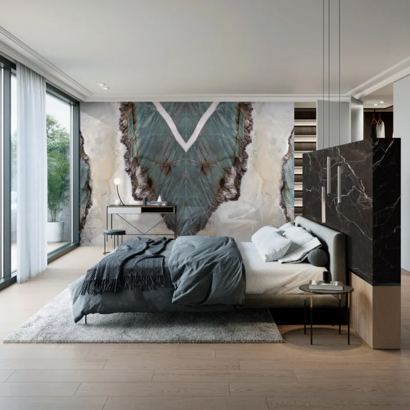
Centered on the bed rather than on the wall, which is the right call and not the automatic one.
Can you bookmatch anything? Only stone with strong directional veining is worth the effort, so the quartzites and the onyxes and some of the heavier marbles, and a uniform speckled granite gives you nothing because there’s no figure to mirror in the first place. The teal in these images reads like Patagonia quartzite or a porcelain doing an impression of it, and I’d want to put my hand on it before saying which, because the good large format porcelain has gotten close enough that photographs stopped being reliable a while ago.
Backlighting only pays off if light can get through the stone
The column in the first image is glowing from behind, and that’s the one detail in this whole set that people copy without checking whether their material can do it.
Real onyx is translucent. It’s a banded calcite, light passes through it, and that’s why it’s been used for window panes and lampshades for a couple of thousand years. Porcelain is not translucent, or barely, so if you order a porcelain slab because it looks identical in the showroom and then build an LED cavity behind it, you get a dark wall with a faint bright line where the light strip sits. Some manufacturers now make thin backlit-rated panels specifically for this and they’re a different product from the standard slab.
Even with genuine onyx it isn’t plug and play. The panel needs a cavity of a few inches behind it so the LEDs diffuse instead of printing themselves onto the face as hot spots, the strips have to be spaced evenly, and the whole assembly needs to come apart when a driver fails, which it will. Onyx is also soft and often comes mesh-backed with resin, which means the fabricator handles it more like glass than like stone.
The blue and copper set belongs in a shop and one of these images admits it
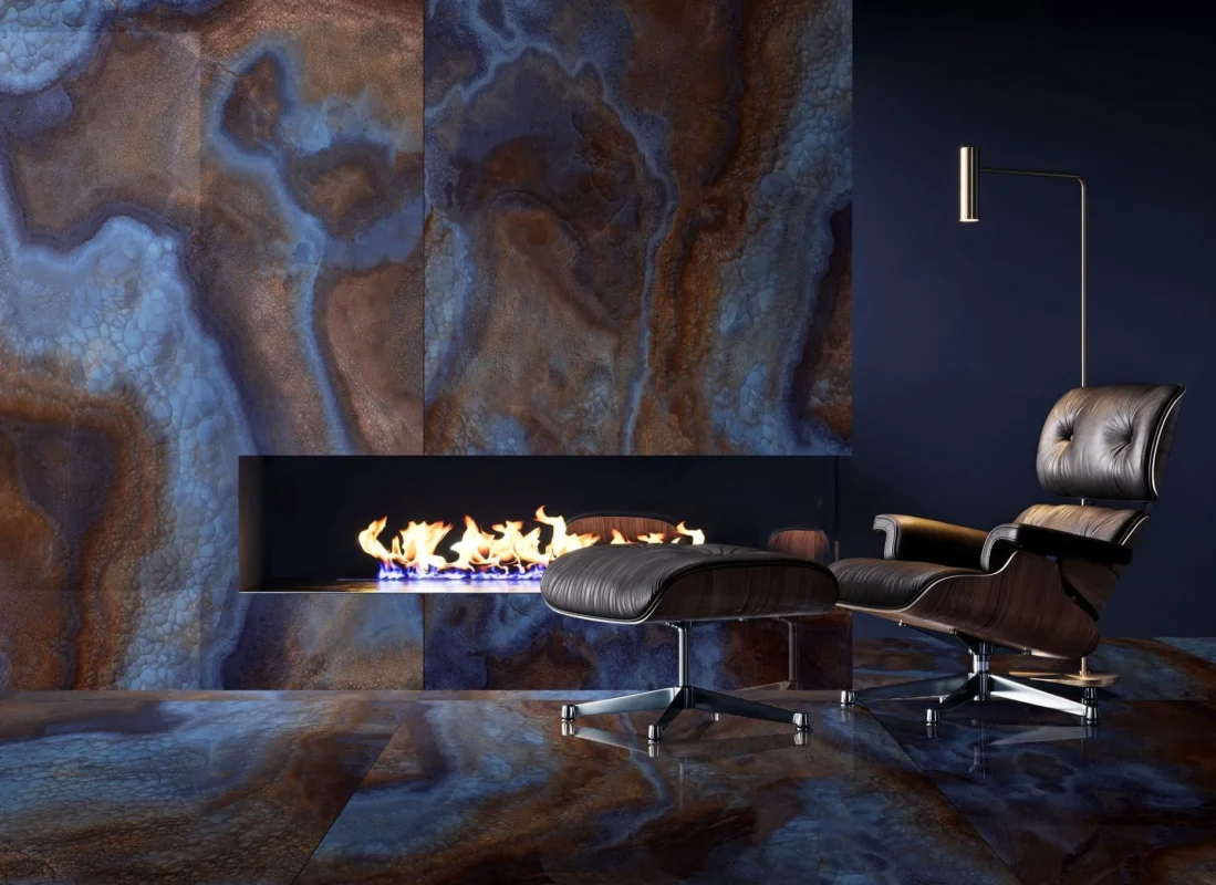
One chair, one lamp, one black wall. Add a rug and a bookshelf and this falls apart.
Three images, and the third one is a clothing store.

Which tells you most of what you need to know about where this palette is comfortable.
That’s the honest read on this palette. It’s spectacular and it’s commercial, the sort of surface that works when people are moving through a space for twenty minutes rather than sitting in it every evening, and the fireplace shot only holds together because everything around it has been stripped down to a black wall and one chair. Put a normal amount of life in that room, a couch with cushions on it, a rug, some books, and the floor starts fighting everything you own.
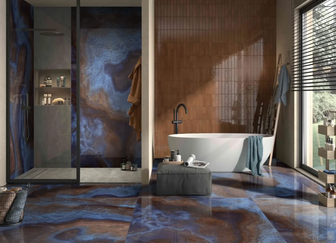
Notice the shower tray is a flatter, plainer material. That isn’t an accident.
The bathroom version I’d argue about with someone and probably lose.
A gloss floor needs a wet DCOF of 0.42 before it goes anywhere near a bathroom
Every reflective floor in this set is doing a lot of visual work, and the reflection is the point, but polished porcelain and polished marble both fall short of the wet slip threshold that US tile standards set for interior floors expected to get wet. ANSI A137.1 puts that number at 0.42 wet DCOF, and a mirror-polished surface generally lands under it. Manufacturers publish the figure. Ask for it and read it before the tile is on a truck.
| Finish | Wet floor use | What it shows | Where it earns its place |
|---|---|---|---|
| Polished | Poor, check DCOF first | Every footprint, water spot, fine scratch | Feature walls, low traffic living areas |
| Honed | Better, still verify | Etching on marble, less shine to lose | Living rooms, bedrooms, powder rooms |
| Matte | Good | Very little | Bathroom and kitchen floors |
| Structured or grip | Best | Traps grime in the texture | Wet rooms, curbless showers, pool surrounds |
The other half of that conversation is chemistry rather than traction. Marble is calcium carbonate and acid dulls it, so lemon juice, wine, most bathroom cleaners, and the pale beige floors in this set would all get chalky patches inside a year in a real kitchen. Quartzite handles that far better. Porcelain doesn’t care at all. Which is a boring reason to choose porcelain and also the correct one, most of the time.
Dark bathrooms eat more light than anyone plans for
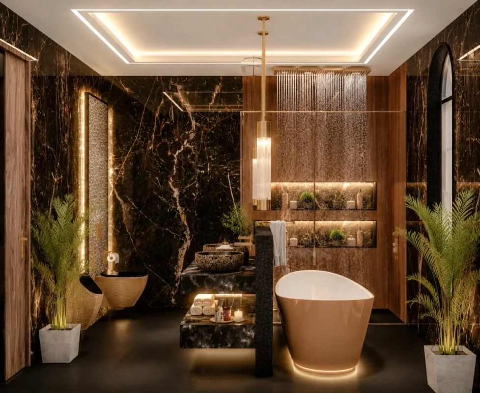
Cove, niches, mirror strip, a glow under the tub and another under the vanity. The middle of the ceiling contributes nothing at all.
Count the light sources in that room. Perimeter cove above the ceiling tray, strip lighting inside every niche, a lit strip running down the mirror, uplighting under the tub, a glow under the vanity, plus whatever is washing the shower wall. Six or seven separate circuits, and none of them is a ceiling light in the middle of the room.
That’s not decoration, it’s compensation. Dark polished stone absorbs most of what you throw at it and reflects the rest into a hard bright spot you don’t want, so the lighting has to be spread across a lot of small sources and hidden. Do the same room with one recessed downlight per corner and it reads like a basement.
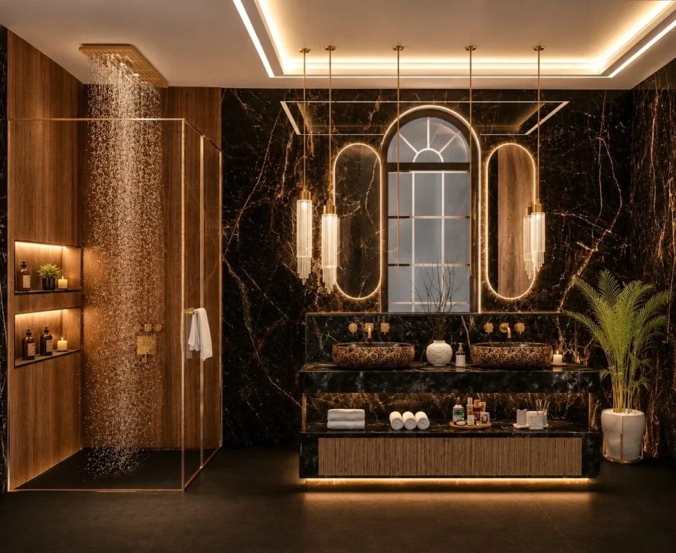
Patterned vessel basins on a black stone deck, which is a lot of ornament on a surface you use half asleep.
Worth saying that the arched window is doing more for that second room than the marble is. It breaks the grid, it’s the only curve in a space full of straight lines apart from the mirrors, and the mirrors are clearly there to rhyme with it.
About the leopard
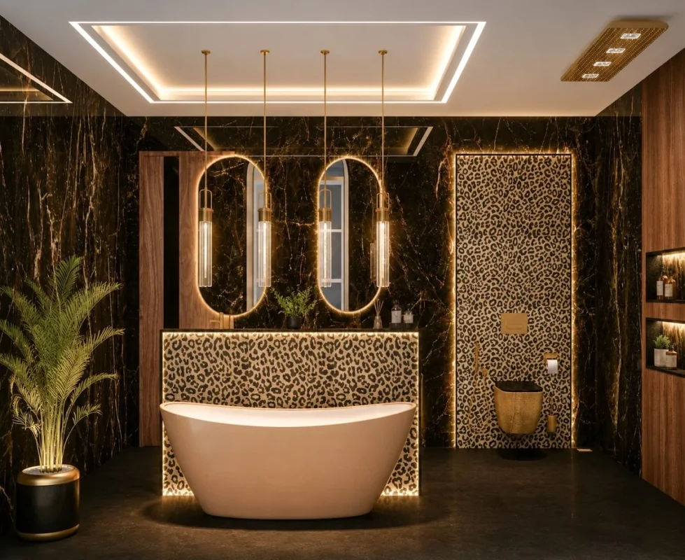
Full height behind the tub, then repeated behind the toilet. My problem is the scale, I think.
I keep going back and forth on this one. It’s a printed panel, backlit, sitting behind the tub and repeated behind the toilet, and my first reaction was that it cheapens a room that was otherwise holding together. Then I looked again at the first image in that group, which has the same animal print as a much smaller inset beside the vanity, and the smaller one works fine. So maybe the issue is scale rather than the print itself. Or maybe I’ve just talked myself into it because I looked at it for too long. Somebody with a stronger opinion about animal print should take this one off my hands.
Navy cabinets, striated floor and the floor wins
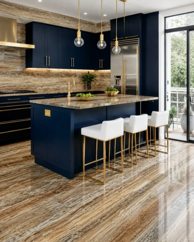
The slim gold pulls are the nicest detail in this kitchen and you have to hunt for them.
The cabinets here are the best thing in the room, a deep navy shaker with slim gold hardware, and you barely register them because the floor, the backsplash, the counters and the island top are all running the same busy horizontal striation at the same volume. Four surfaces, one pattern, no rest anywhere for your eye to land.
Pick one. If the floor is that loud the counters want to be quiet, and if you love the counters then the floor should be doing almost nothing. The version of this kitchen I’d want has the striated stone on the backsplash and island only, with a plain honed floor underneath, and suddenly the navy gets to be the story.
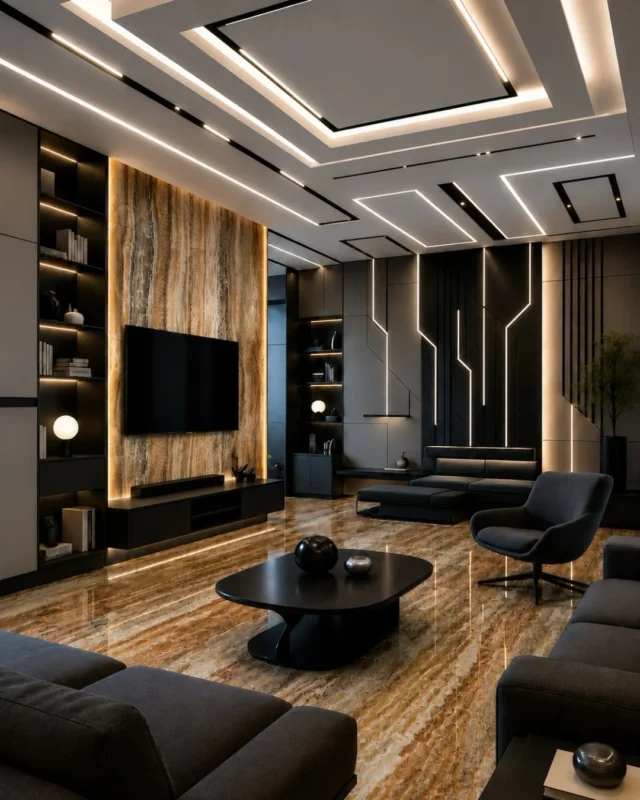
Ceiling channels like these look incredible and turn into a plasterboard job the first time a driver dies behind one.
The living room from that same group gets it right, mostly, because the pattern is contained inside a lit frame around the TV and the rest of the walls are flat black paneling.
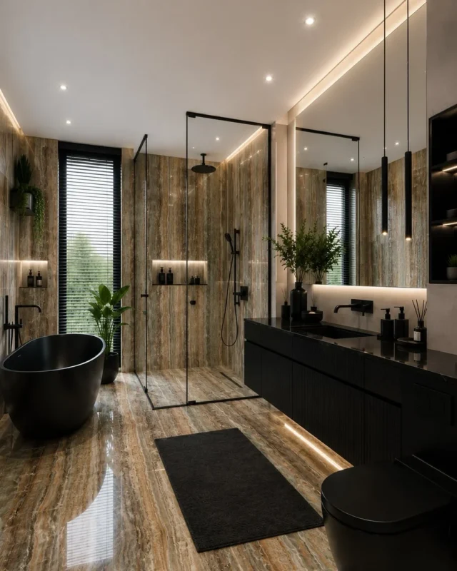
Ribbed black joinery, which gives the eye somewhere quiet to sit.
The beige rooms are the safest thing in this set, which is exactly the problem
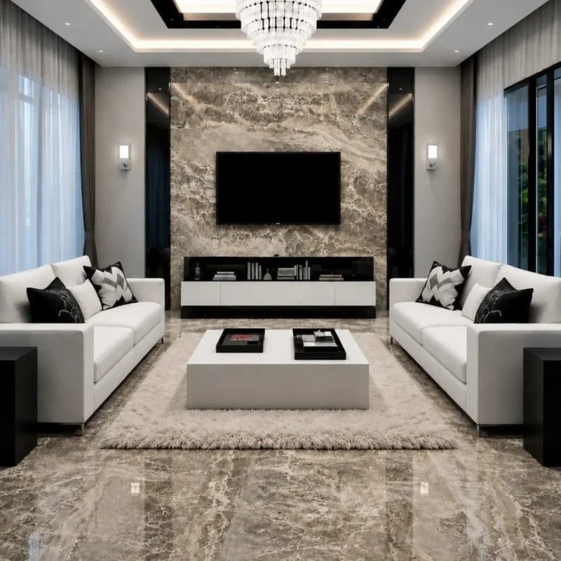
Mirrored down the middle, cushions included.
Two identical sofas facing each other, a coffee table dead center, a marble panel behind the TV with a light on either side. Every choice here is the one that can’t be criticized, which is a different thing from being good.
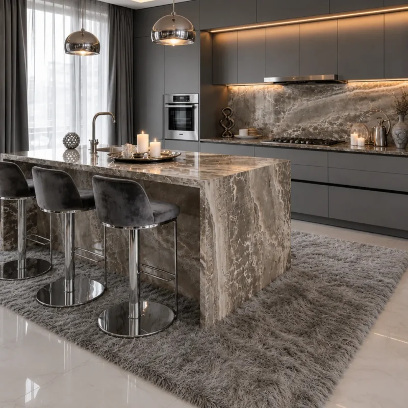
Velvet stools against polished stone, a pairing that photographs better than it wears.
The waterfall island is worth a note though, because the vein runs off the top and down the side without a break, and that continuity is a miter joint cut at 45 degrees through the thickness of the slab and glued so the seam nearly disappears. It’s fiddly, it’s charged accordingly, and half the time you see it done the pattern jumps at the corner because nobody sequenced the cut. This one lines up.
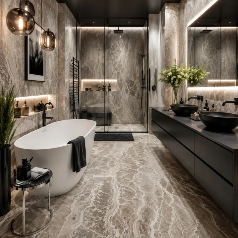
Black vanity, warm marble, white tub. You have seen this room before and you will see it again.
Nothing in these three rooms will offend a buyer in eight years. Nothing in them will be remembered either.
Most of what makes these images look expensive isn’t the material, it’s that every one of them was lit by someone who knew where to hide the strips. Strip the cove lighting out and half of these rooms collapse into a dark box with a nice wall in it. If the budget only stretches to one of the two, spend it on the lighting and buy the porcelain.