


The number that decides everything: LRV 73
Most color guides open with undertones. Start with light reflectance instead, because with SW 7035 that single figure predicts more of what goes wrong than any discussion of beige versus greige.
Aesthetic White sits at an LRV of 73.097, which Samplize publishes alongside it’s RGB of 227 / 221 / 211 and a hex approximation of #E3DDD3.
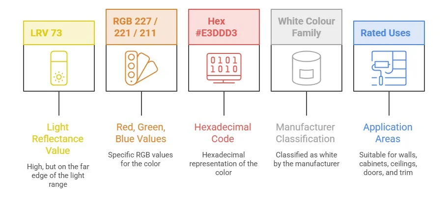
| Property | Value |
|---|---|
| LRV | 73 |
| RGB | 227 / 221 / 211 |
| Hex | #E3DDD3 |
| SW color family | White |
| Rated uses | Walls, cabinets, ceilings, doors, trim |
Seventy-three is an awkward place to live. It is not close enough to true white to behave like trim paint and not deep enough to hold it’s own as a proper beige. Color consultant James, who has reviewed this color repeatedly against real client rooms, puts it on the far edge of the light range rather than inside the white range and her practical verdict is that Aesthetic White does it’s best work in a room with average natural light and nothing extreme in either direction.
That matters more than it sounds. A bright room will wash it out until it reads like a plain off-white and the beige disappears. A dark room will flatten it. The color has a narrow band of light where it looks like what the fan deck promised and outside that band it goes somewhere else.
Cool white with a purple undertone. Consultants say the opposite.
Worth pausing on, because the two authorities disagree and the disagreement is not trivial.
The manufacturer’s own classification files Aesthetic White as a cool white leaning purple. Mawdsley’s assessment after seeing it in dozens of real homes is that it is neither cool nor white, but a soft beige with what she calls a feather-dusting of gray over the top.
Both descriptions are defensible, which is the interesting part. The L*a*b* readings show no green in the color and not a great deal of red either. A color low in both directions has nothing anchoring it, so it drifts. It picks up whatever the room hands it. Green lawn outside a window, a red feature wall, a warm oak floor, all of it pushes SW 7035 somewhere slightly different and that instability is why one homeowner sees purple and another sees a comforting beige.
If you want a color that stays put, this is not the color. If you want one that quietly matches whatever else is in the room, it might be exactly right.
The north-facing advice you will read everywhere is backwards
Search this color and you will find repeated claims that it excels in north-facing rooms, that the gray anchor stops it going yellow in cool light, that designers reach for it first when a north-facing brief lands on the desk.
The evidence points the other way.
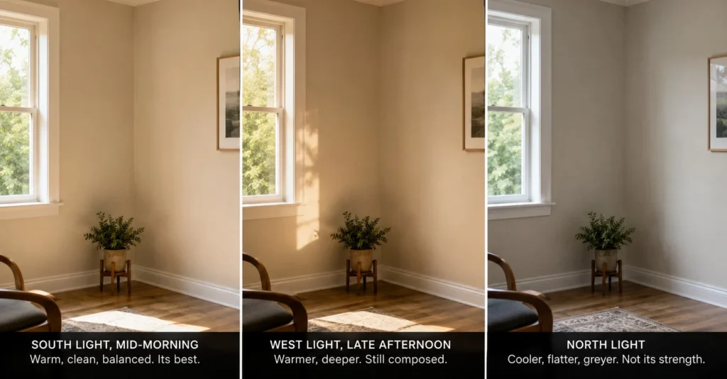
North light is cool and indirect and it pulls the gray component of Aesthetic White forward. Mawdsley’s own guidance is that in a north-facing room you should expect it to lean toward the grayish end. It keeps a passive warmth underneath, because it is a warm color at heart, but the surface reading tips gray. Where the color genuinely performs is south-facing rooms and in afternoon western light, where it holds it’s warmth without going toasty the way a golden beige does.
Think about why that makes sense mechanically. A color that resists yellowing in cool light does so by having something cool in it and that something does not switch off when the light gets cooler. It amplifies. The gray that protects you from a lemon cast in north light is the same gray that will read as flat and slightly cold on a north wall in January.
So the correction is simple and it inverts the common advice:
- South-facing and west-facing rooms: strong candidate, warmth holds, no toasty cast
- North-facing rooms: possible, but expect gray and sample on the actual wall before committing a whole floor
- Rooms with very little natural light: skip it or fix the lighting first with the right bulb temperature
- Very bright rooms: it washes out, though walls and trim in the same color can work as a soft envelope
There is a related irritation worth naming. Half the color content published about paint reads like it was assembled from other color content rather than from rooms and this north-facing claim is a good example of a mistake that propagates because nobody sampled anything. Which is a general problem with the category and not really the fault of the color.
One homeowner painted it at 125% and watched it change at noon
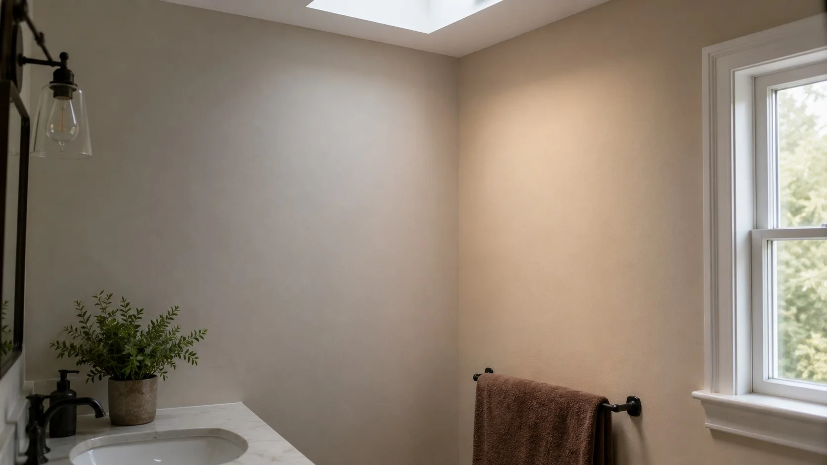
The clearest documentation of the drift comes from a reader named Nancy, who described her results in the comments of Mawdsley’s review after finishing a primary bathroom.
Her room had a small south-facing transom window, a partial twelve-foot ceiling and, as she remembered only after the paint was on the wall, a large skylight. She had it mixed at 125%, a quarter deeper than standard, to build contrast against Origami White trim she had been stuck with for fifteen years.
Her report: the color leaned gray and stark until roughly midday, then shifted into a warm beige for the rest of the day and into the evening. She used the word unbelievable about the size of the swing. She liked the afternoon version enough to start swapping her towels from white to a medium brown to support it.
Three ladders were involved. She described the finished result as less than half bad, which is about as honest as painting reviews get.
That single account tells you more than any coordinating-colors list. The color has a schedule.
Trim: Pure White and Extra White work, Alabaster is a fight
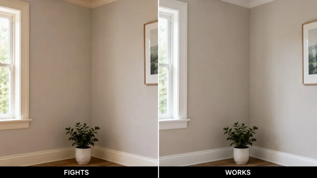
You will see Alabaster recommended as a trim partner for SW 7035 on the theory that the small difference in warmth adds depth. In practice it tends to be the wrong direction. Alabaster carries noticeably more yellow and Aesthetic White is fussy about whites that are too warm or creamy sitting next to it. The two read as a mismatch rather than a gradient.
What holds up:
- Pure White SW 7005, the default recommendation, clean without being cold
- Extra White SW 7006, which sounds too stark on paper, though the trim and cabinet formulation reads warmer than the wall version and softens the contrast
- Benjamin Moore White Dove, lightened by 25%, a trick Mawdsley uses in her own home
Aesthetic White also does not want to be paired with other off-whites at a similar depth. Put it next to Shoji White at LRV 74 and you get a muddle rather than a contrast, because a single point of separation is not separation.
What it is actually competing against
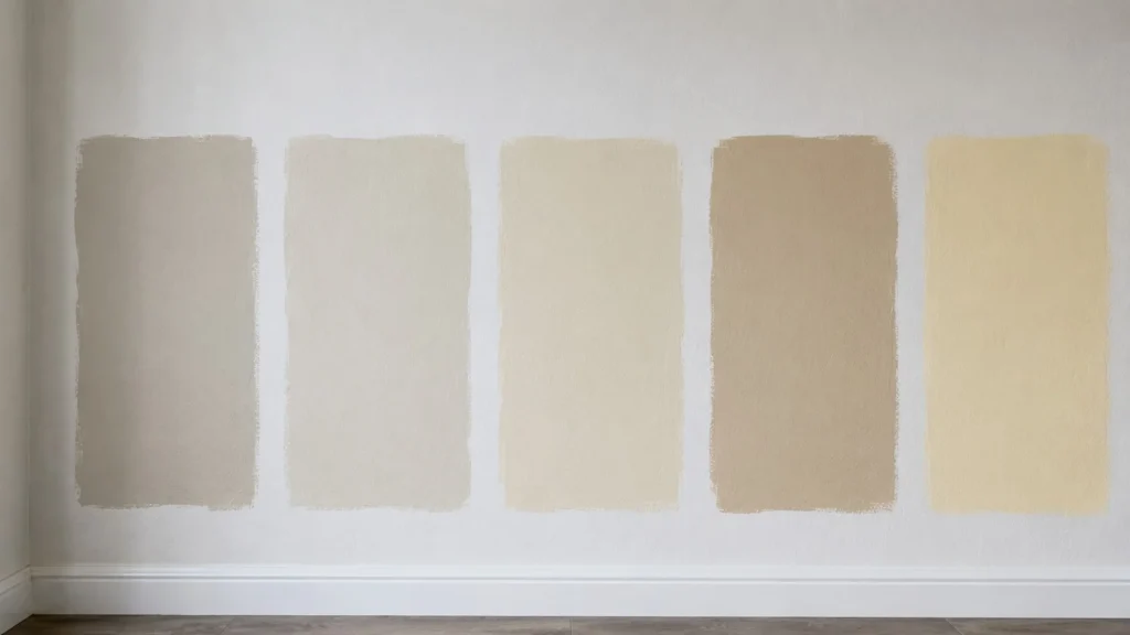
The comparison people reach for most is Greek Villa, usually framed as two colors close in depth. They are not close. Greek Villa sits at LRV 84, eleven points brighter, with a clear cream-yellow undertone that reads sunny and direct. It is a different job entirely.
| Color | LRV | Undertone | How it differs |
|---|---|---|---|
| Aesthetic White SW 7035 | 73 | Muted beige with gray over it | The reference point |
| Shoji White SW 7042 | 74 | Faint cream base, most likely of the group to flash pink | One point apart in depth, warmer underneath |
| White Duck SW 7010 | 74 | Creamy, yellow leaning, neutralized | Softer and less gray |
| Accessible Beige SW 7036 | 58 | Warm beige with real body | Fifteen points deeper, more color, less gray drift |
| Greek Villa SW 7551 | 84 | Cream-yellow | Much brighter and committed to warmth |
Accessible Beige is the pairing people ask about most, usually as cabinets with Aesthetic White above. It can work. It is also the combination most likely to fall apart, because Aesthetic White dips toward gray more readily than Accessible Beige does and in the wrong light the walls stop reading as a relative of the cabinets and start reading as a mistake.
For Benjamin Moore alternatives, Sea Pearl gives you something lighter with a similar temperament and Maritime White comes at beige with more purpose and a bit more depth.
Cabinets are where it earns it’s keep
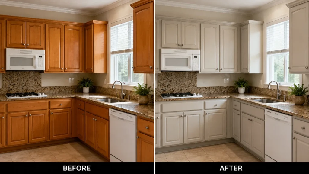
The strongest documented use of SW 7035 is not walls. It is cabinets, specifically as a rescue color for maple and cherry kitchens from the late nineties and early two thousands.
Mawdsley’s before-and-after files show orange-toned wood cabinets painted in Aesthetic White against granite counters and beige tile floors that were never replaced. The color is warm enough to sit with an aging countertop without arguing with it and gray enough that it does not read as the creamy cabinet finish people are trying to get away from. For anyone nervous about white cabinets and equally nervous about cream ones, that middle position is the whole appeal.
The limit is Tuscan-era finishes. Travertine, heavy orange-pink stone and the deeper terracotta palette of that period usually need a wall or cabinet color with more orange in it than Aesthetic White has. Same for exteriors with a lot of beige brick, where it can come up short and read cold against the masonry.
The lightening and darkening trick worth knowing
Aesthetic White responds well to this and it comes up constantly in real projects:
- At 75% (lightened by a quarter), it moves closer to a workable whole-house off-white for people who find the standard mix too heavy
- At 125%, it gains depth for contrast against trim, though whether it gains warmth is less clear. Nancy, who tried exactly this, said she could not tell
I have not seen a controlled comparison of the two mixes side by side in the same room and I would not claim the warmth question is settled.
Where a designer said no
Refusals are more useful than recommendations and there are three on record for this color.
Asked about Aesthetic White walls with Agreeable Gray cabinets, Mawdsley’s answer was that the combination made her nervous. Asked about a BM Collingwood accent wall alongside it, the answer was a flat no, on the grounds that Collingwood is too gray-purple and would drag Aesthetic White’s own purple tendency into view. And when a reader with orange-based furnishings floated Aesthetic White as a cabinet color, the advice was to avoid it because it would land too dark and too grayed-out against her finishes.
What holds up as a palette instead: greiges at LRV 60 or lower, muted blue-green grays like Argos and medium to dark greens, which sit well against the organic base underneath the color.