


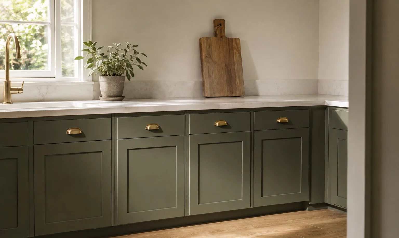
The word sage is doing a lot of lying in the paint aisle. On Pinterest sage means practically nothing, a breath of green on a white-adjacent wall and the whole internet has agreed to call that sage even though the actual herb is a dusty medium gray-green that would read dark on most people’s walls. Clary Sage SW 6178 is named honestly. That’s the problem. It looks like the plant, not like the hashtag and every disappointed review of this color comes down to someone shopping for the hashtag.
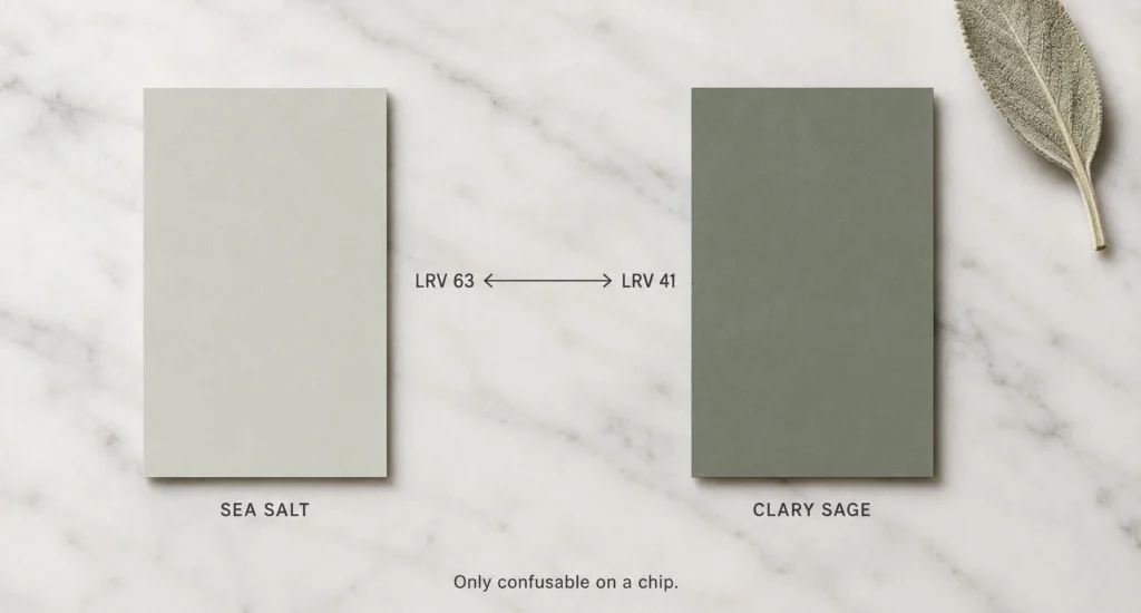
Forty-one. That’s the light reflectance number and it means the color absorbs more light than it gives back. Hold that against Sea Salt at 63, which is what most sage-searchers are picturing and there is no version of confusing the two on a wall. Only on a chip. Chips lie almost as much as the word does.
I like this color a great deal, for what it’s worth. In a bright room it’s one of the most livable mid-greens makes, calm without being beige about it and the heavy gray dose in the base keeps it from ever going fresh or minty. But liking it means saying plainly what it does after 4pm in a dim room, which is slide gray, then keep sliding until by lamplight it’s flirting with olive. The yellow undertone that makes it warm in sunlight is the same undertone that goes olive in the dark. Same paint. The room votes last.
Cabinets, where most of it is going anyway
Walls are the traditional use and bedrooms genuinely suit the enveloping thing it does, but watch where this color is being sold right now and it’s kitchen cabinets, lowers especially. Makes sense. At this depth it holds real presence against a pale quartz counter, nothing like heavy and against butcher block it does the organic look people want without committing to a forest green they’ll be staring down in 2031. Brass pulls warm it up. Matte black sharpens it. Fine.
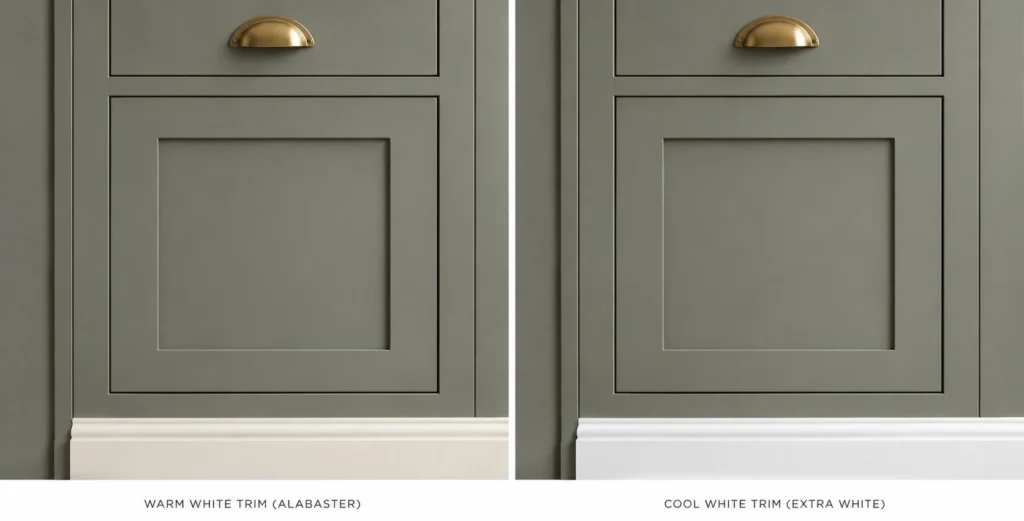
The trim question matters more than the hardware question, though and it’s the one mistake I see repeated. Clary Sage is muted and stark cool whites next to muted colors turn the whole thing clinical, the contrast reads like a lab. Warm whites only. Alabaster, Shoji White, Creamy if the room leans farmhouse. Pure White is the coolest I’d allow near it and even that’s for people who want the sharpest possible edge.
If you’re sorting cabinet greens generally: this is the soft traditional one, Evergreen Fog is the grayer contemporary one, Dried Thyme is deeper, more olive, a statement rather than a backdrop. Different tools.
The October Mist thing
Benjamin Moore’s October Mist was a Color of the Year, 2022 and it sits at 46.5, a touch lighter than Clary Sage and slightly less olive. On a screen you’d struggle to split them. On a wall you won’t. And here’s my actual view on the pair: October Mist is the trend document and a kitchen painted in a color-of-the-year is datable to that cycle the way a millennial gray kitchen is datable to 2015. Clary Sage SW 6178 was in the deck before the sage trend and will be there after it, which is either the whole argument for it or completely irrelevant to you and I can’t decide that part for you.
The rest of the field, quickly, because these come up: Weekend Getaway from BM runs just under at 38.8, greener, less olive. SW’s own Green Onyx at 31 is the next step down when a room or an island wants more weight. Valspar Cool Pine is near enough to identical that the choice is about which store is closer. And Clary Sage sits at the bottom of the same physical strip as Sagey, Liveable Green and Softened Green, 6175 through 6178, a strip that works like a volume dial and I’ve written before that on the light end of that dial the lighter choice almost always wins over time. Down here the logic flips. At 41 you already decided you want real color. The risk isn’t too dark anymore, it’s the wrong room and a wrong room at this depth doesn’t soften with styling, it just stays wrong and you repaint.
The herb, by the way, clary sage SW 6178, the actual plant, is grown mostly for perfume oil and the leaves have a silvery fuzz that catches light in a way no flat paint will. I looked it up while writing this and now I want the fuzz more than the paint. No conclusions from that. Just where the research went.